This post is about processing currency data which I have been collecting since the end of 2014. The data is collected once every hour from Monday 12am till Friday 11pm.
The data-set itself is not large as the frequency of collection is low, but it does cover lots of interesting world events such as Nigerian currency devaluation, Brexit, Trump Presidency, BJP Government in India, EU financial crisis, Demonetisation in India etc.
The image below shows the percentage change histogram for three common currencies (GBP – British Pound, USD – US Dollar and INR – Indian Rupee). The value for Percentage Change (X-Axis) is between -4% and 2%
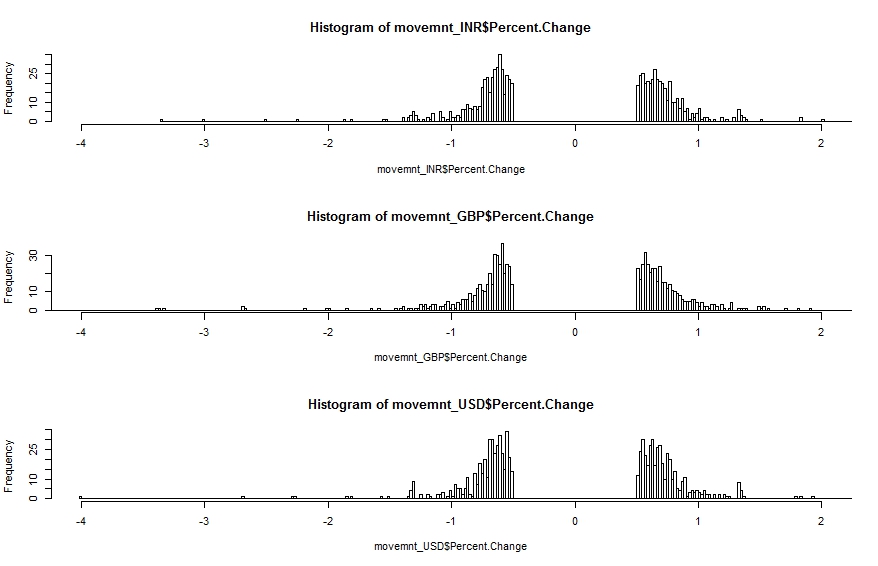
What is immediately clear is the so called ‘fat-tail’ configuration. The data is highly skewed and shows clear features of ‘power law’ statistics. In other words the percentage change is related to frequency by an inverse power law. Larger changes (up or down) are rarer than small changes but not impossible (with respect to other distributions such as the Normal Distribution).
The discontinuity around Percentage Change = 0% is intentional. We do not want very small changes to be included as these would ‘drown out’ medium and large changes.
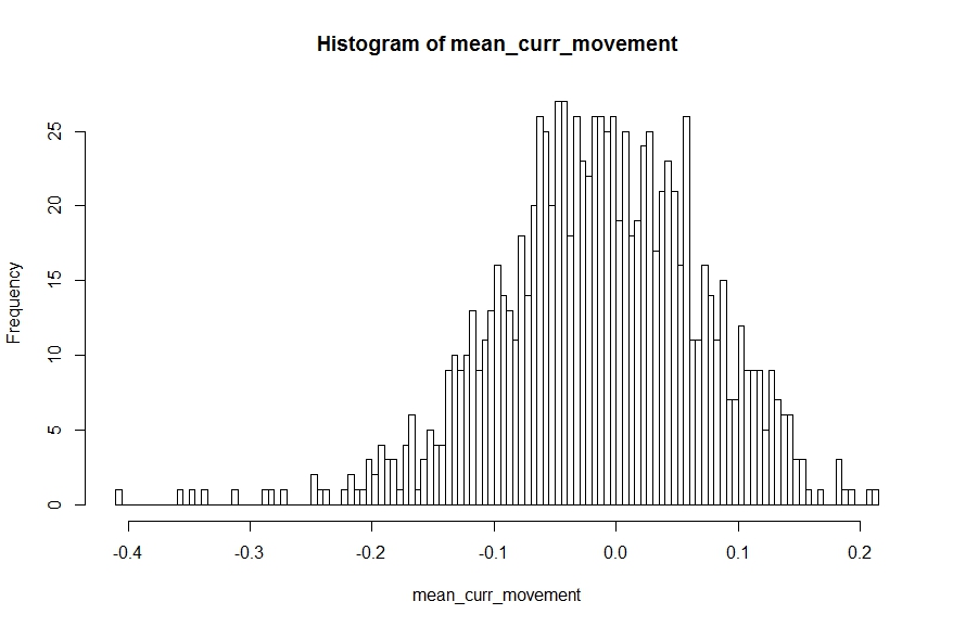
We can use the R code snippet below to draw 100 samples with replacement from the movement data (combined across all currencies) and calculate the sample mean. The sample means can be plotted on a histogram which should give us the familiar Normal Distribution [this is the ‘Central Limit Theorem’ in action]. The sample mean that is most common is 0% – which is not an unexpected result given the presence of positive and negative change percentages.
[codesyntax lang=”javascript”]
mean_curr_movement <- replicate(1000, {
mean__curr_movement<-mean(
		sample(data$Percent.Change,100,replace = TRUE)
		)
	}
)
[/codesyntax]
Compare this with a Normal distribution where, as we move away from the mean, the probability of occurrence reduces super-exponentially making large changes almost impossible (also a super-exponential quantity reduces a lot faster than a square or a cube).
Equilibrium Theory (or so called Efficient Market Hypothesis) would have us believe that the market can be modelled using a Bell Curve (Normal Distribution) where things might deviate from the ‘mean’ but rarely by a large amount and in the end it always converges back to the ‘equilibrium’ condition. Unfortunately with the reality of power-law we cannot sleep so soundly because a different definition of rare is applicable there.
Incidentally earthquakes follow a similar power law with respect to magnitude. This means that while powerful quakes are less frequent than milder ones they are still far from non-existent.
Another magical quality of such systems is that fluctuations and stability often come in clusters. The image below show the percentage movement over the full two years (approx.). We see a relative period of calm (green area) bracketed by periods of high volatility (red areas).
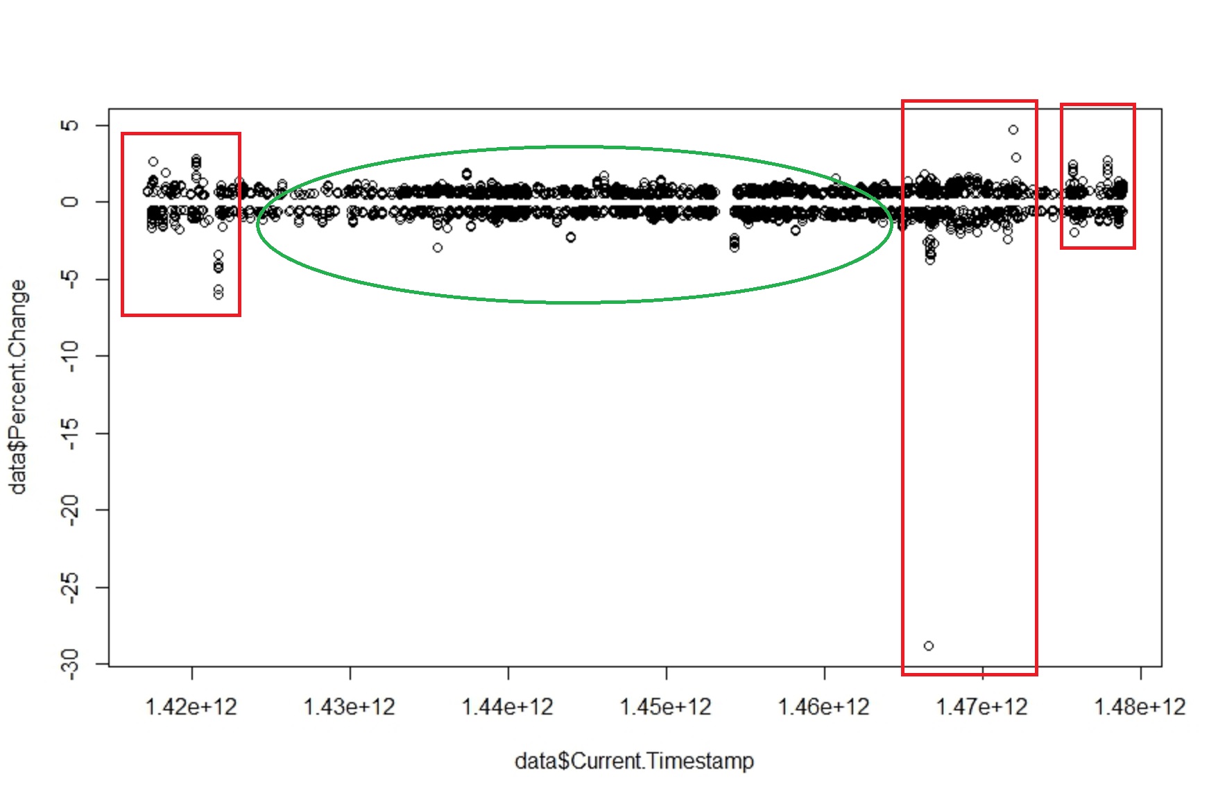
The above graph shows that there are no ‘equilibrium’ states within the price. The invisible hand has not magically appeared to calm things down and reduce any gaps between demand and supply to allow the price of the currency to re-adjust. Otherwise we would have found that larger the change larger the damping force to resist the change – there by making sudden large changes impossible.
For the curious:
All the raw currency data is collected in an Influx DB instance and then pulled out and processed using custom window functions I wrote in JAVA. The processed data is then dumped into a CSV (about 6000 rows) to be processed in R.
We will explore this data-set a bit more in future posts! This was to get you interested in the topic. There are large amounts of time series data sets available out there that you can start to analyse in the same way.
All the best!