Recurrent Neural Networks to Predict Pricing Trends in UK Housing Market

Recurrent Neural Networks (RNN):

RNNs are used when temporal relationships have to be learnt. Some common examples include time series data (e.g. stock prices), sequence of words (e.g. predictive text) and so on.

The basic concept of RNNs is that we train an additional set of weights (along with the standard input – output pair) that associate past state (time: t-1) with the current state (time: t). This can then be used to predict the future state (time: t+1) given the current state (time: t). In other words RNNs are NNs with state!

When used to standard time series prediction the input and output values are taken from the same time series (usually a scalar value). This is a degenerate case of single valued inputs and outputs. Thus we need to learn the relationship between x(t-1) and x(t) so that we can predict the value of x(t+1) given x(t). This is what I did for this post.

Time series can be made more complicated by making the input a vector of different parameters, the output may still remain a scalar value which is a component of x or be a vector. One reason this is done is to add all the factors that may impact the value to be predicted (e.g. x(t+1)). In our example of average house prices – we may want to add factors such as time of the year, interest rates, salary levels, inflation etc. to provide some more “independent” variables in the input.

Two final points:

  • Use-cases for RNNs: Speech to Text, Predictive Text, Music Tagging, Machine Translation
  • RNNs include the additional complexity of training in Time as well as Space therefore our standard Back-Propagation becomes Back-Propagation Through Time

RNN Structure for Predicting House Prices:
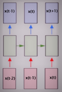
RNN simple time series

The basic time series problem is that we have a sequence of numbers – the average price of houses for a given month and year (e.g. given: X(1), X(2), … X(t-1), X(t) ) with a regular step size and our task is to predict the next number in the sequence (i.e. predict: X(t+1)). In our problem the avg price is calculated for every month since January 1995 (thus step size is 1 month). As a first step we need to define a fixed sequence size that we are going to use for training the RNN. For the input data we will select a sub-sequence of a given length equal to the number of inputs (in the diagram above there are three inputs). For training output we will select a sub-sequence of the same length as the input but the values will be shifted one step in the future.

Thus if input sub-sequence is: X(3), X(4) and X(5) then the output sub-sequence must be: X(4), X(5) and X(6). In general if input sub-sequence spans time step to where b > a and b-a = sub-sequence length, then the output sub-sequence must span a+1 to b+1.

Once the training has been completed if we provide the last sub-sequence as input we will get the next number in the series as the output. We can see how well the RNN is able to replicate the signal by starting with a sub-sequence in the middle and movie ahead in time steps and plotting actual vs predicted values for the next number in the sequence.

Remember to NORMALISE the data!

The parameters are as below:

n_steps = 36 # Number of time steps (thus a = 0 and b = 35, total of 36 months)

n_inputs = 1 # Number of inputs per step (the avg. price for the current month)

n_neurons = 1000 # Number of neurons in the middle layer

n_outputs = 1 # Number of outputs per step (the avg. price for the next month)

learning_rate = 0.0001 # Learning Rate

n_iter = 2000 # Number of iterations

batch_size = 50 # Batch size

I am using TensorFlow’s BasicRNNCell (complete code at the end of the post) but the basic setup is:

X = tf.placeholder(tf.float32, [None, n_steps, n_inputs])
y = tf.placeholder(tf.float32, [None, n_steps, n_outputs])

cell = tf.contrib.rnn.OutputProjectionWrapper(tf.contrib.rnn.BasicRNNCell(num_units = n_neurons, activation = tf.nn.relu), output_size=n_outputs)

outputs, states = tf.nn.dynamic_rnn(cell, X, dtype = tf.float32)

loss = tf.reduce_mean(tf.square(outputs-y))
opt = tf.train.AdamOptimizer(learning_rate=learning_rate)
training = opt.minimize(loss)

saver = tf.train.Saver()

init = tf.global_variables_initializer()

Results:

A sample of 3 runs, using Mean Squared Error threshold of 1e-4 we get the following values for Error:

  1. 8.6831e-05
  2. 9.05436e-05
  3. 9.86998e-05

Run 3 fitting and predictions are shown below:

Orange dots represent the prediction by the RNN and Blue dots represent the actual data
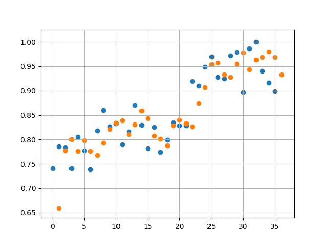
 

Run 3 prediction against existing data 3 years before October 2017

Then we start from October 2017 (Month 24 in figure below) and forecast ahead to October 2018. This predicts a rise in average prices which start to plateau 3rd quarter of 2018. Given that average house prices across a country like UK are determined by a large number of noisy factors, we should take this prediction with a pinch of salt.

Run 3 Forecasting from Month 24 (October 2017 for the year ahead till October 2018)

A sample of 3 runs, using Mean Squared Error threshold of 1e-3 we get the following values for Error:

  1. 3.4365e-04
  2. 4.1512e-04
  3. 2.1874e-04

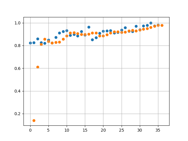
With a higher Error Threshold we find when comparing against actual data (Runs 2 and 3 below) the predicted values have a lot less overlap with the actual values. This is expected as we have traded accuracy for reduction in training time.
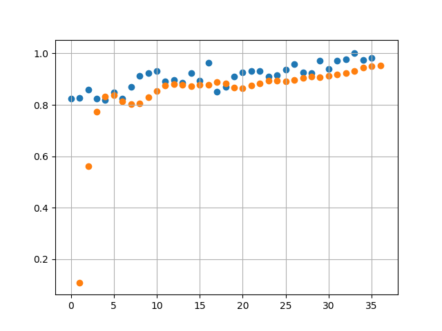
predicted avg price vs actual avg price (Run 2)
predicted avg price vs actual avg price (Run 3)

Projections in this case are lot different. We see a linearly decreasing avg price in 2018.
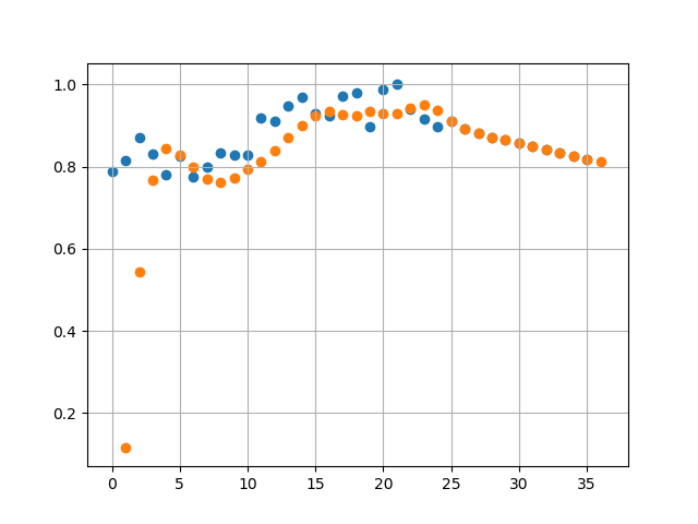
predicted avg price vs actual avg price with forecast

Next Steps:

I would like to add more parameters to the input – but it is difficult to get correlated data for different things such as interest rates, inflation etc.

I would also like to try other types of networks (e.g. LSTM) but I am not sure if that would be the equivalent of using a canon to kill a mosquito.

Finally if anyone has any ideas on this I would be happy to collaborate with them on this!


Source code can be found here: housing_tf

Contains HM Land Registry data © Crown copyright and database right 2017. This data is licensed under the Open Government Licence v3.0.
UK Housing Data Analysis: Additional Price Paid Entry

I have been exploring the HM Land Registry Price Paid Data and have discovered few more things of interest.

The data contains a ‘Price Paid Data Category Type’ (this is the second last column at the time of writing this post. As per the description of the schema this field can have one of two values:

A = Standard Price Paid entry, includes single residential property sold for full market value.
B = Additional Price Paid entry including transfers under a power of sale/repossessions, buy-to-lets (where they can be identified by a Mortgage) and transfers to non-private individuals.

Therefore it seems there is a way of looking at how properties sold for full market value differ from buy-to-lets, repossessions and power of sale transactions. Proper Category B tracking only starts from October 2013.

Before we do this it is worthwhile to use the ‘Property Type’ field to filter out properties of type ‘Other’ which contribute to the overall noise because these are usually high value properties such as office buildings. The ‘Property Type’ field has the following values:

D = Detached,

S = Semi-Detached,

T = Terraced,

F = Flats/Maisonettes,

O = Other

Data Pipeline for all transactions:

Step 1: Filter out all transactions with Property Type of Other

Step 2: Group using Year and Month of Transaction

Step 3: Calculate Standard Deviations in Price, Average Price and Counts


Data Pipeline for Standard and Additional Price Paid Transactions (separate):

Step 1: Filter out all transactions with Property Type of Other

Step 2: Group using Price Paid Data Category Type, Year and Month of Transaction

Step 3: Calculate Standard Deviations in Price, Average Price and Counts

Tech stuff:

I used a combination of MongoDB (aggregation pipelines for standard heavy weight aggregations – such as simple grouping), Apache Spark (Java based for heavy weight custom aggregations) and Python (for creating graphs and summarising aggregated data)

Results:

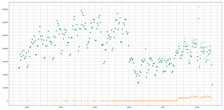
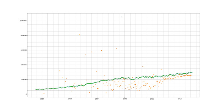
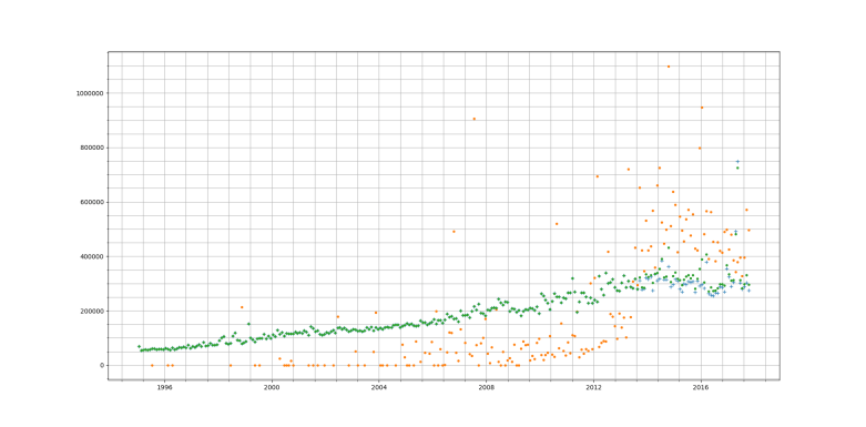
In all graphs Orange points represent Category B related data, Blue represents Category A related data and Green represents a combination of both the Categories.

Transaction Counts

Price Paid Data Category A/B Transaction Count

Category B transactions form a small percentage of the overall transactions (5-8% appprox.)

As the Category B data starts from October 2013 we see a rapid increase in Category B transactions which then settles to a steady rate till 2017 where we can see transactions falling as it becomes less lucrative to buy a second house to generate rental income. There is a massive variation in terms of overall and Category A transactions. But here as well we see a downward trend in 2017.

We can also see the sharp fall in transactions due to the financial crisis around 2008.

In all graphs Orange points represent Category B related data, Blue represents Category A related data and Green represents a combination of both the Categories.

Average Price

Price Paid Data Category A/B Average Price

Here we find an interesting result. Category B prices are consistently lower than pure Category A. But given the relatively small number of Category B transactions the average price of combined transactions is fairly close to the average price of Category A transactions. This also seems to point to the fact that in case of buy to let, repossessions and power of sale conditions the price paid is below the average price for Category A. Several reasons could exist for such a result:

  1. People buy cheaper properties as buy-to-let and use more expensive properties as their main residence.
  2. Under stressful conditions (e.g. forced sale or repossession) there is urgency to sell and therefore full market rate may not be obtainable.

Standard Deviation of Prices

Price Paid Data Category A/B Price Standard Dev.

The variation in the price for Category B properties is quite high when compared with Category A (the standard price paid transaction). This can point to few things about the Category B market:

  1. A lot more speculative activity is carried out here therefore the impact of ‘expectation’ on price paid is very high – particularly:
    1. ‘expected rental returns’: The tendency here will be to buy cheap (i.e. lowest possible mortgage) and profit from the difference between monthly rental and mortgage payments over a long period of time.
    2. ‘expected profit from a future sale’: The tendency here will be to keep a shorter horizon and buy cheap then renovate and sell at a higher price – either through direct value add or because of natural increase in demand.
  2. For a Standard transaction (Category A) the incentive to speculate may not be present as it is a basic necessity.

Contains HM Land Registry data © Crown copyright and database right 2017. This data is licensed under the Open Government Licence v3.0.
UK House Sales Analysis

I have been looking at house sales data from the UK (actually England and Wales). This is derived from the Land Registry data set (approx. 4GB) which contains all house sales data from mid 1990s. Data contains full address information so one can use reverse geo-coding to get the location of the sales.

Sales Density Over the Years

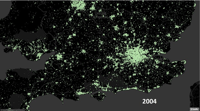
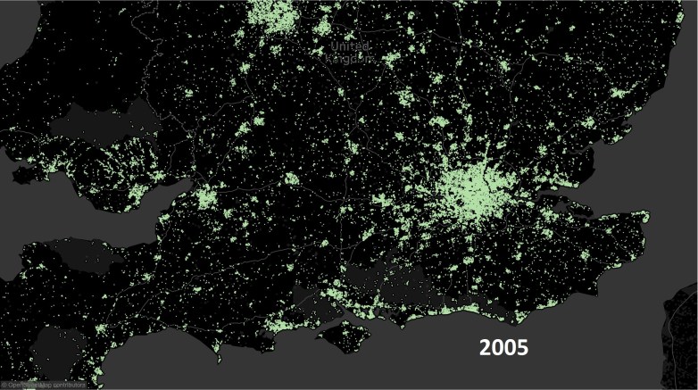
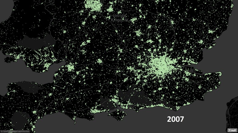
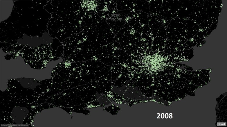
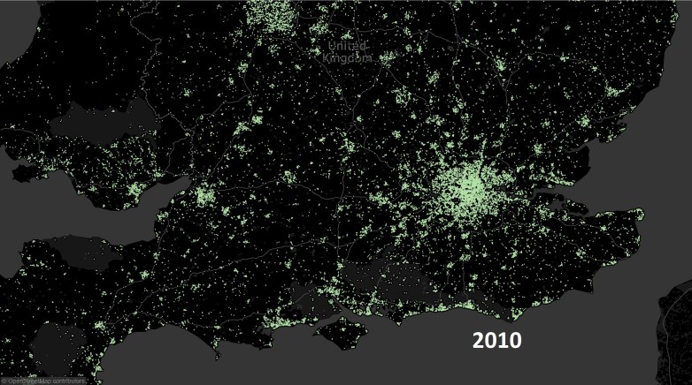
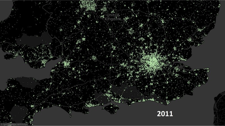
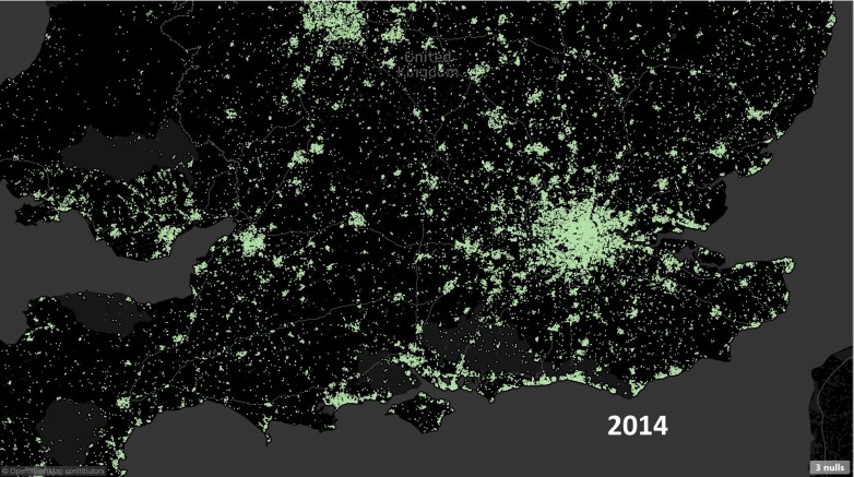
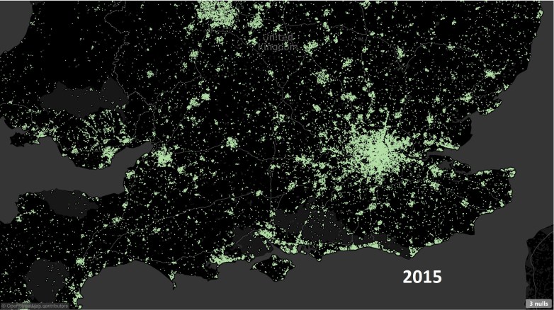
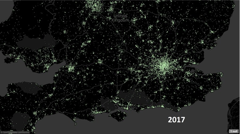
If we compare the number of sales over the years an interesting picture emerges. Below is the geographical distribution of active regions (w.r.t. number of sales).

Years 2004-2007 there is strong activity in the housing market – this is especially true for London (the big patch of green), South coast and South West of England.

The activity penetrates deeper (look at Wales and South West) as the saturation starts to kick in.
The financial crisis hits and we can immediately see a weakening of sales across England and Wales. It becomes more difficult to get a mortgage. Market shows first signs of recovery especially around London.  Market recovery starts to gain momentum especially outside London.
The recovery is now fairly widespread thanks to various initiative by the Government, rock bottom interest rates and a generally positive feeling about the future. Brexit and other factors kick in – the main issue is around ‘buy-to-let’ properties which are made less lucrative thanks to three-pronged attack: increase in stamp duty on a second house, removal of tax breaks for landlords and tightening of lending for a second home (especially interest-only mortgages).

Finally 2017 once can see that the market is again cooling down. Latest data suggests house prices have started falling once again and with the recent rise in interest rates it will make landing a good deal on a mortgage all that more difficult.

Average House Prices

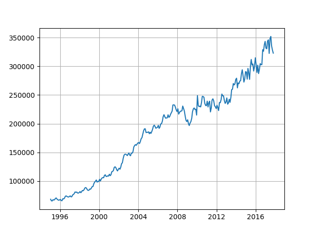
Above graph shows how the Average price of Sales has changed over the Years. We see there is a slump in prices starting from 2017. It will be interesting to see how the house prices behave as we start 2018. It will be a challenge for people to afford higher mortgages as inflation outstrips income growth. This is especially true for first-time buyers. Given the recent bonanza of zero percent stamp duty for first time buyers I am not sure how much of an impact (positive) this will have.

Returns on Properties

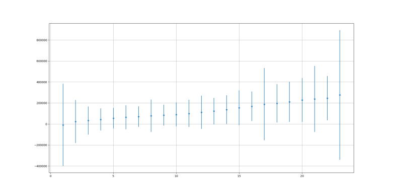
Above graph shows how the returns and risks associated with a house change after a given number of years. It is clear that it is easier to get a return when a house is held for at least 5 years. Below that there is a risk of loosing money on the property. Properties resold within two years are most likely to make a loss. This also ties in with a ‘distress’ sale scenario where the house is sold without waiting for the best possible offer or in times of slowdown where easy term mortgages are not available.

Number of Times Re-sold

Above graph shows the number of times a house is re-sold (vertical) against the number of years it is held for before being re-sold. Most houses are re-sold within 5 years. But why a massive spike where houses are re-sold within 2 years? One possible explanation is that these are houses that are bought by a developer, improved and then re-sold within a year or so.

House Transactions by Month of Year

Transaction by month

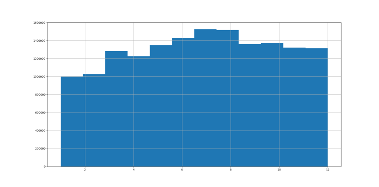
What is the best time of the year to sell your house? Counting number of transactions by month (figure above) we can see number of transactions increases as Spring starts and continues to grow till the end of Summer. In fact 60% more houses are sold in Jun – Aug period as compared to Jan – March.

Transactions tend to decrease slightly as Autumn starts and falls off towards end of the year. This is expected as people would not want to move right after Christmas or early in the new year (winter moves are difficult!)

Infrastructure

I have used Apache Spark (using Java) to summarise the data from approximately 4 GB to 1-1.5 GB CSV files and then Python to do next round of aggregations and to generate the plots.


Next step will be to incorporate some Machine Learning into the process.