I have been exploring the HM Land Registry Price Paid Data and have discovered few more things of interest.
The data contains a ‘Price Paid Data Category Type’ (this is the second last column at the time of writing this post. As per the description of the schema this field can have one of two values:
A = Standard Price Paid entry, includes single residential property sold for full market value.
B = Additional Price Paid entry including transfers under a power of sale/repossessions, buy-to-lets (where they can be identified by a Mortgage) and transfers to non-private individuals.
Therefore it seems there is a way of looking at how properties sold for full market value differ from buy-to-lets, repossessions and power of sale transactions. Proper Category B tracking only starts from October 2013.
Before we do this it is worthwhile to use the ‘Property Type’ field to filter out properties of type ‘Other’ which contribute to the overall noise because these are usually high value properties such as office buildings. The ‘Property Type’ field has the following values:
D = Detached,
S = Semi-Detached,
T = Terraced,
F = Flats/Maisonettes,
O = Other
Data Pipeline for all transactions:
Step 1: Filter out all transactions with Property Type of Other
Step 2: Group using Year and Month of Transaction
Step 3: Calculate Standard Deviations in Price, Average Price and Counts
Data Pipeline for Standard and Additional Price Paid Transactions (separate):
Step 1: Filter out all transactions with Property Type of Other
Step 2: Group using Price Paid Data Category Type, Year and Month of Transaction
Step 3: Calculate Standard Deviations in Price, Average Price and Counts
Tech stuff:
I used a combination of MongoDB (aggregation pipelines for standard heavy weight aggregations – such as simple grouping), Apache Spark (Java based for heavy weight custom aggregations) and Python (for creating graphs and summarising aggregated data)
Results:
In all graphs Orange points represent Category B related data, Blue represents Category A related data and Green represents a combination of both the Categories.
Transaction Counts
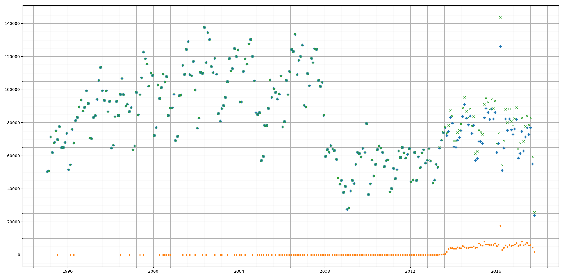
Category B transactions form a small percentage of the overall transactions (5-8% appprox.)
As the Category B data starts from October 2013 we see a rapid increase in Category B transactions which then settles to a steady rate till 2017 where we can see transactions falling as it becomes less lucrative to buy a second house to generate rental income. There is a massive variation in terms of overall and Category A transactions. But here as well we see a downward trend in 2017.
We can also see the sharp fall in transactions due to the financial crisis around 2008.
In all graphs Orange points represent Category B related data, Blue represents Category A related data and Green represents a combination of both the Categories.
Average Price
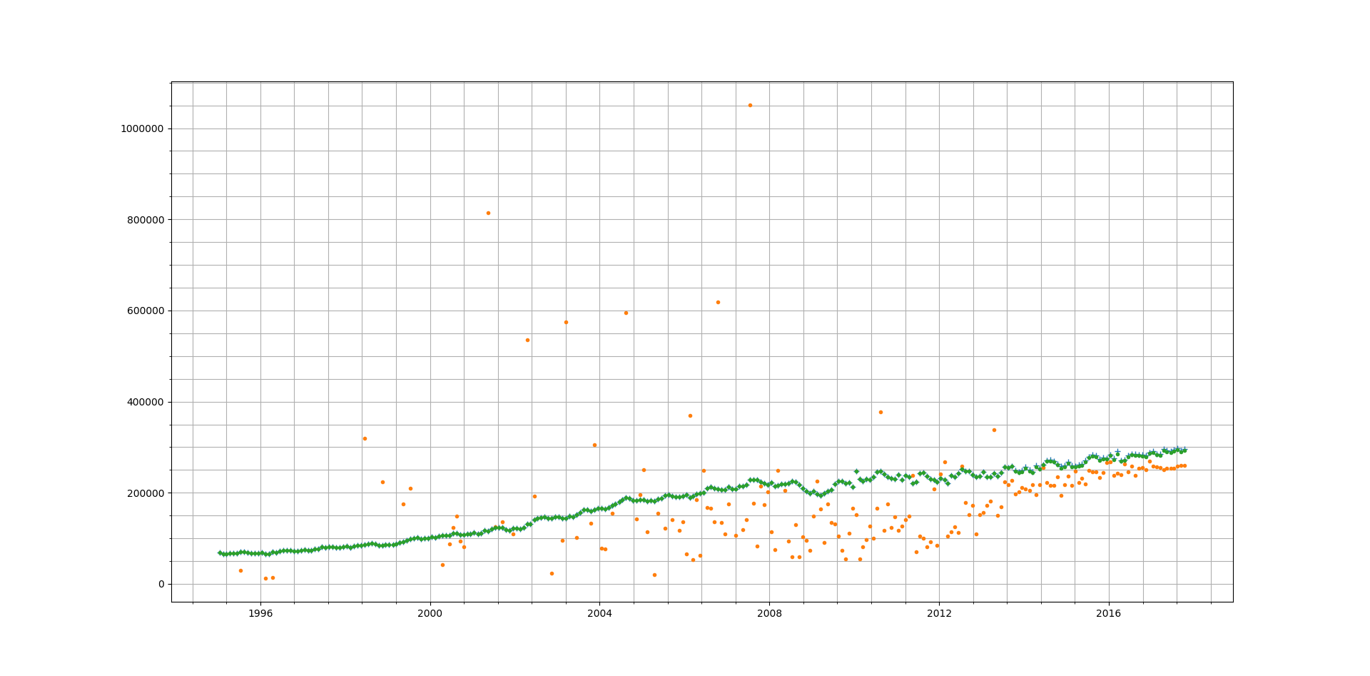
Here we find an interesting result. Category B prices are consistently lower than pure Category A. But given the relatively small number of Category B transactions the average price of combined transactions is fairly close to the average price of Category A transactions. This also seems to point to the fact that in case of buy to let, repossessions and power of sale conditions the price paid is below the average price for Category A. Several reasons could exist for such a result:
- People buy cheaper properties as buy-to-let and use more expensive properties as their main residence.
- Under stressful conditions (e.g. forced sale or repossession) there is urgency to sell and therefore full market rate may not be obtainable.
Standard Deviation of Prices
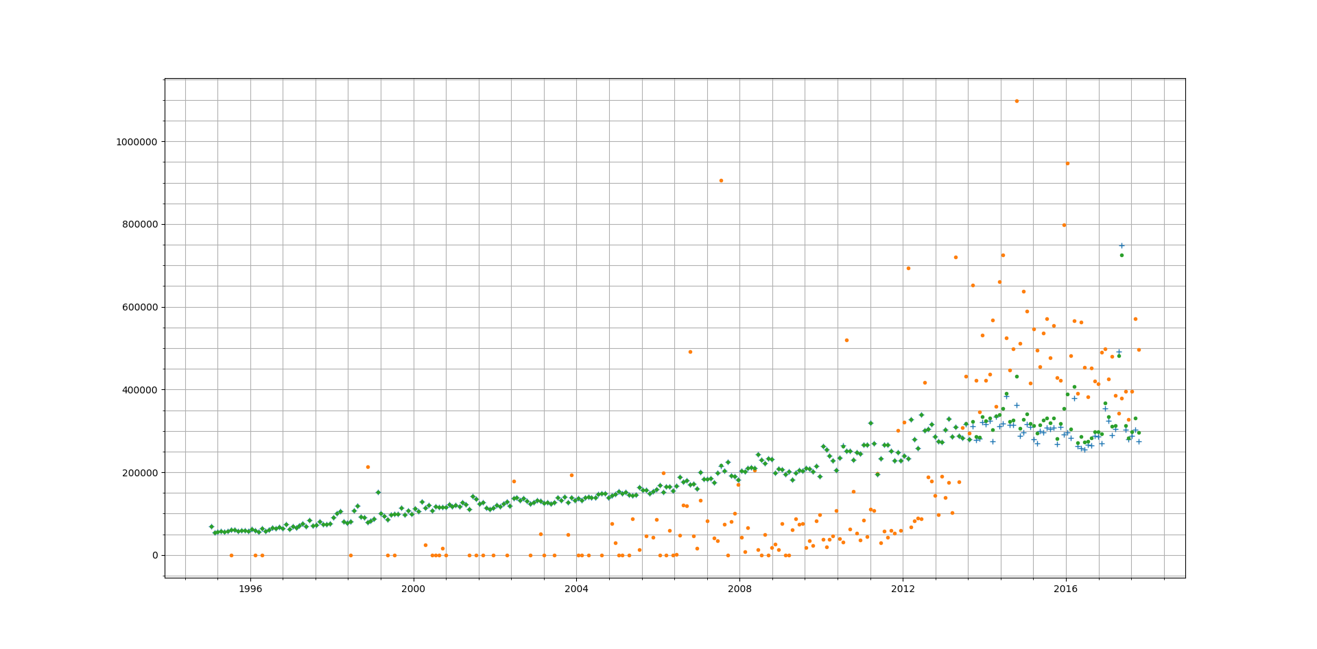
The variation in the price for Category B properties is quite high when compared with Category A (the standard price paid transaction). This can point to few things about the Category B market:
- A lot more speculative activity is carried out here therefore the impact of ‘expectation’ on price paid is very high – particularly:
- ‘expected rental returns’: The tendency here will be to buy cheap (i.e. lowest possible mortgage) and profit from the difference between monthly rental and mortgage payments over a long period of time.
- ‘expected profit from a future sale’: The tendency here will be to keep a shorter horizon and buy cheap then renovate and sell at a higher price – either through direct value add or because of natural increase in demand.
- For a Standard transaction (Category A) the incentive to speculate may not be present as it is a basic necessity.
Contains HM Land Registry data © Crown copyright and database right 2017. This data is licensed under the Open Government Licence v3.0.
