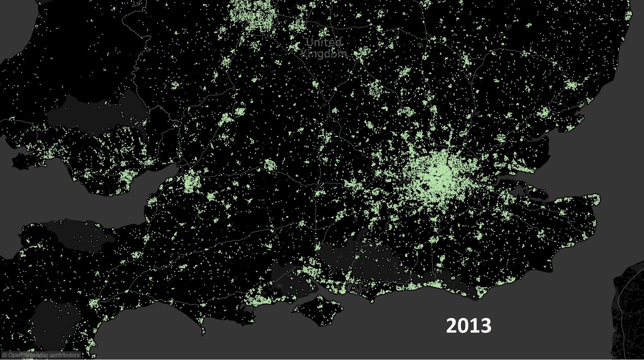
I have been looking at house sales data from the UK (actually England and Wales). This is derived from the Land Registry data set (approx. 4GB) which contains all house sales data from mid 1990s. Data contains full address information so one can use reverse geo-coding to get the location of the sales.
Sales Density Over the Years
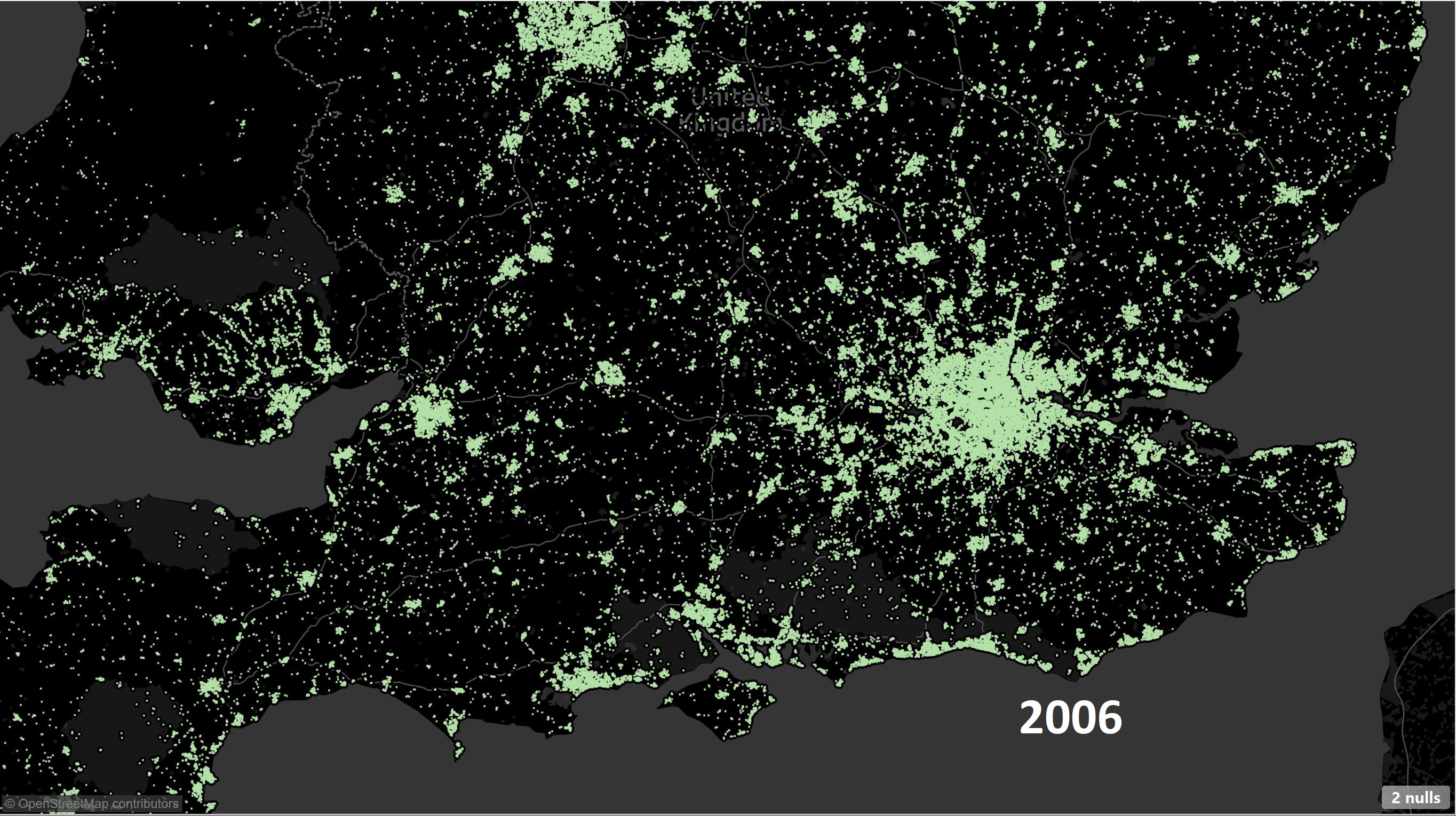
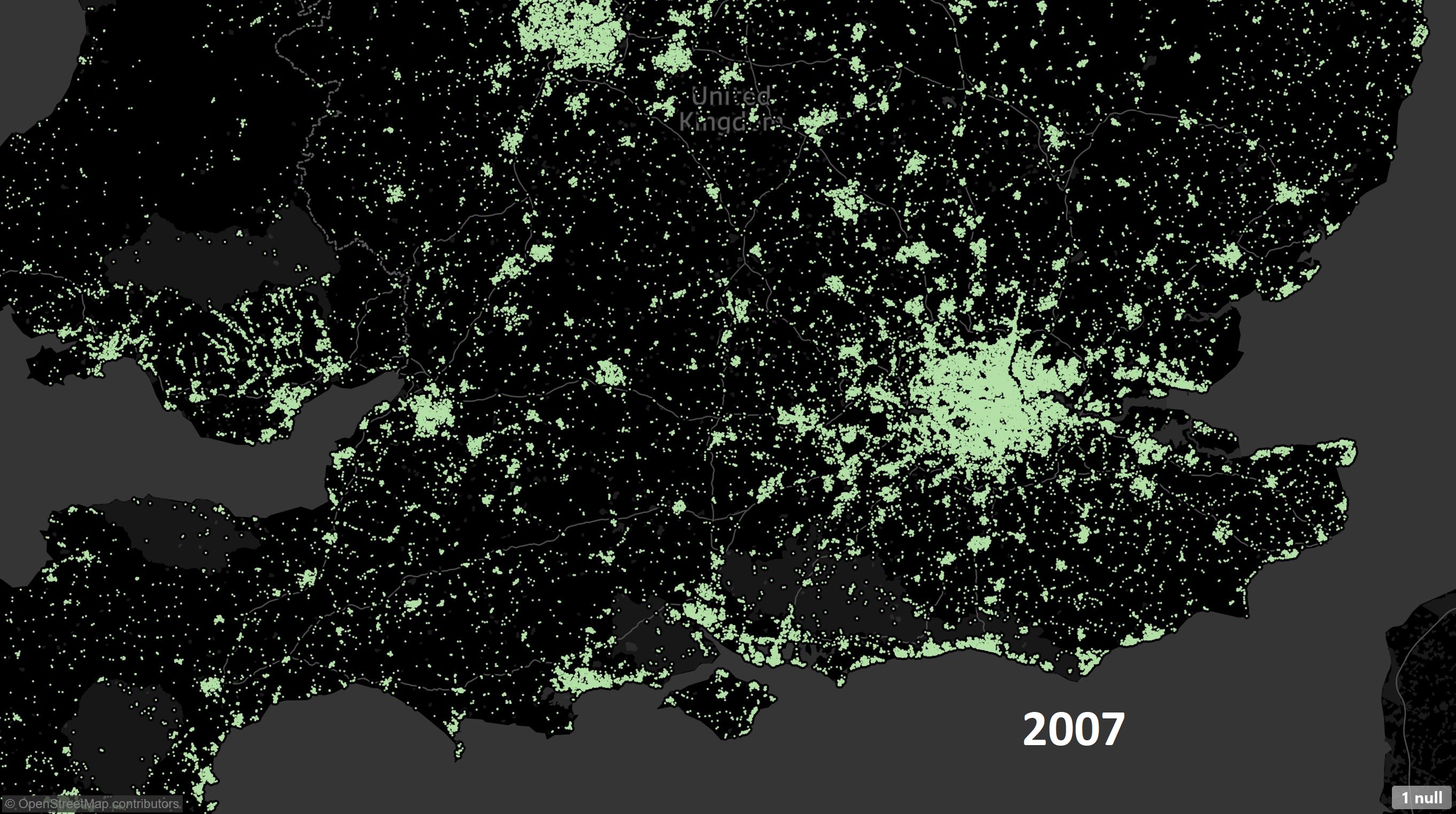
If we compare the number of sales over the years an interesting picture emerges. Below is the geographical distribution of active regions (w.r.t. number of sales).
Years 2004-2007 there is strong activity in the housing market – this is especially true for London (the big patch of green), South coast and South West of England.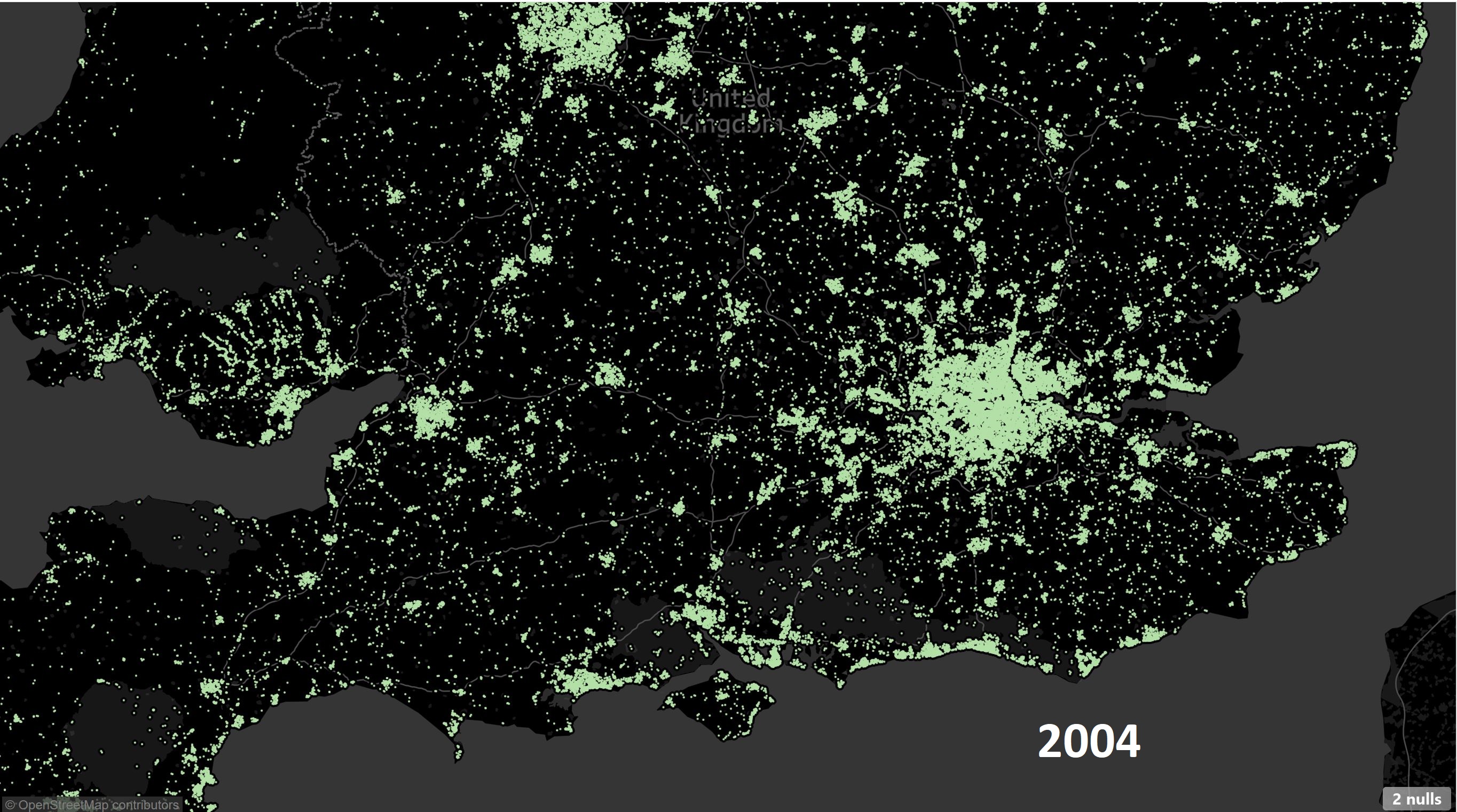
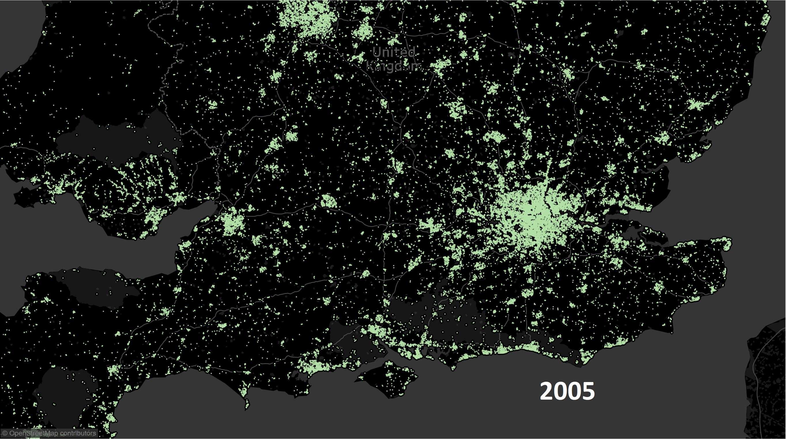
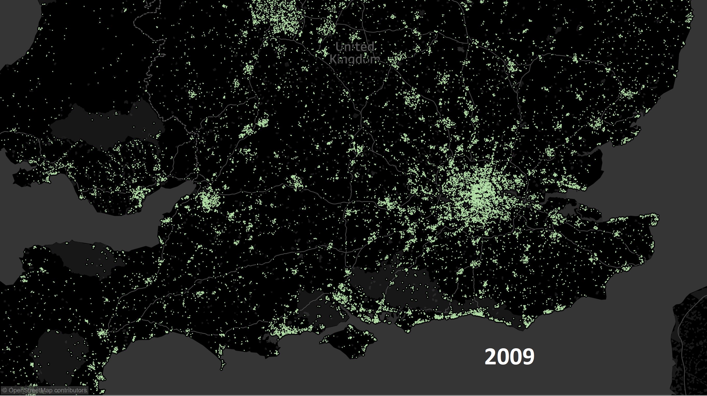
The activity penetrates deeper (look at Wales and South West) as the saturation starts to kick in.
 The financial crisis hits and we can immediately see a weakening of sales across England and Wales. It becomes more difficult to get a mortgage.
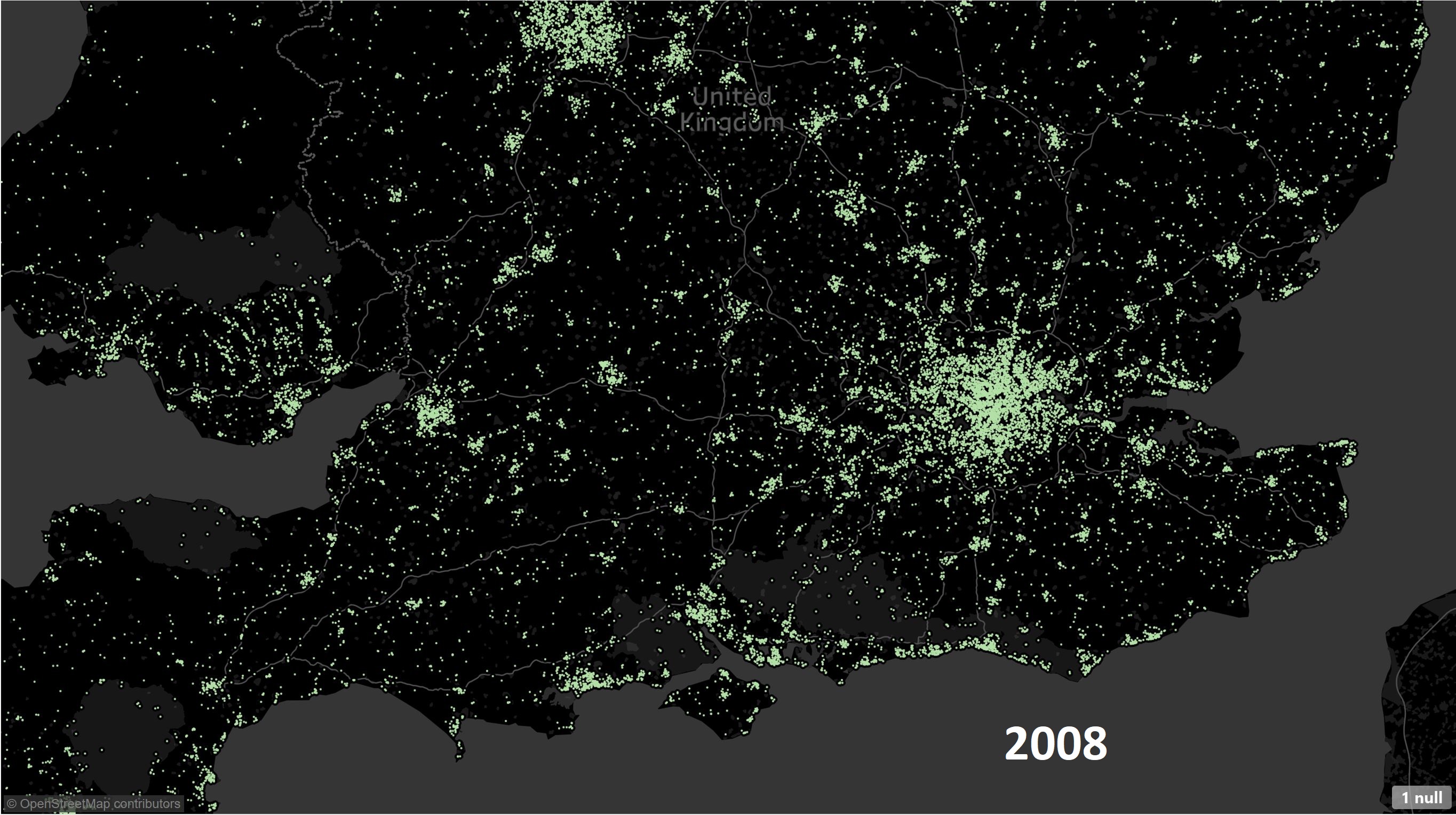
 Market shows first signs of recovery especially around London.
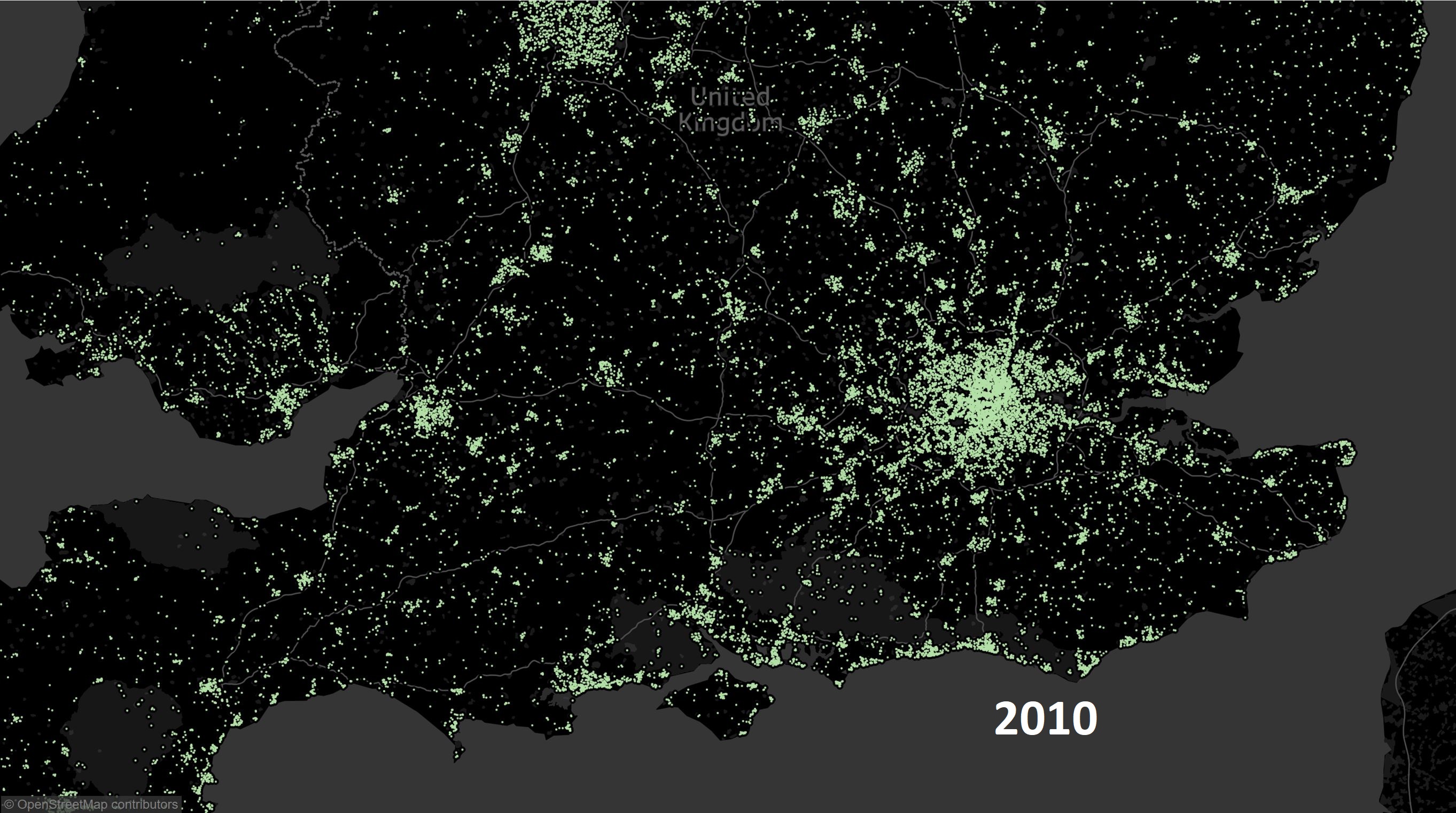
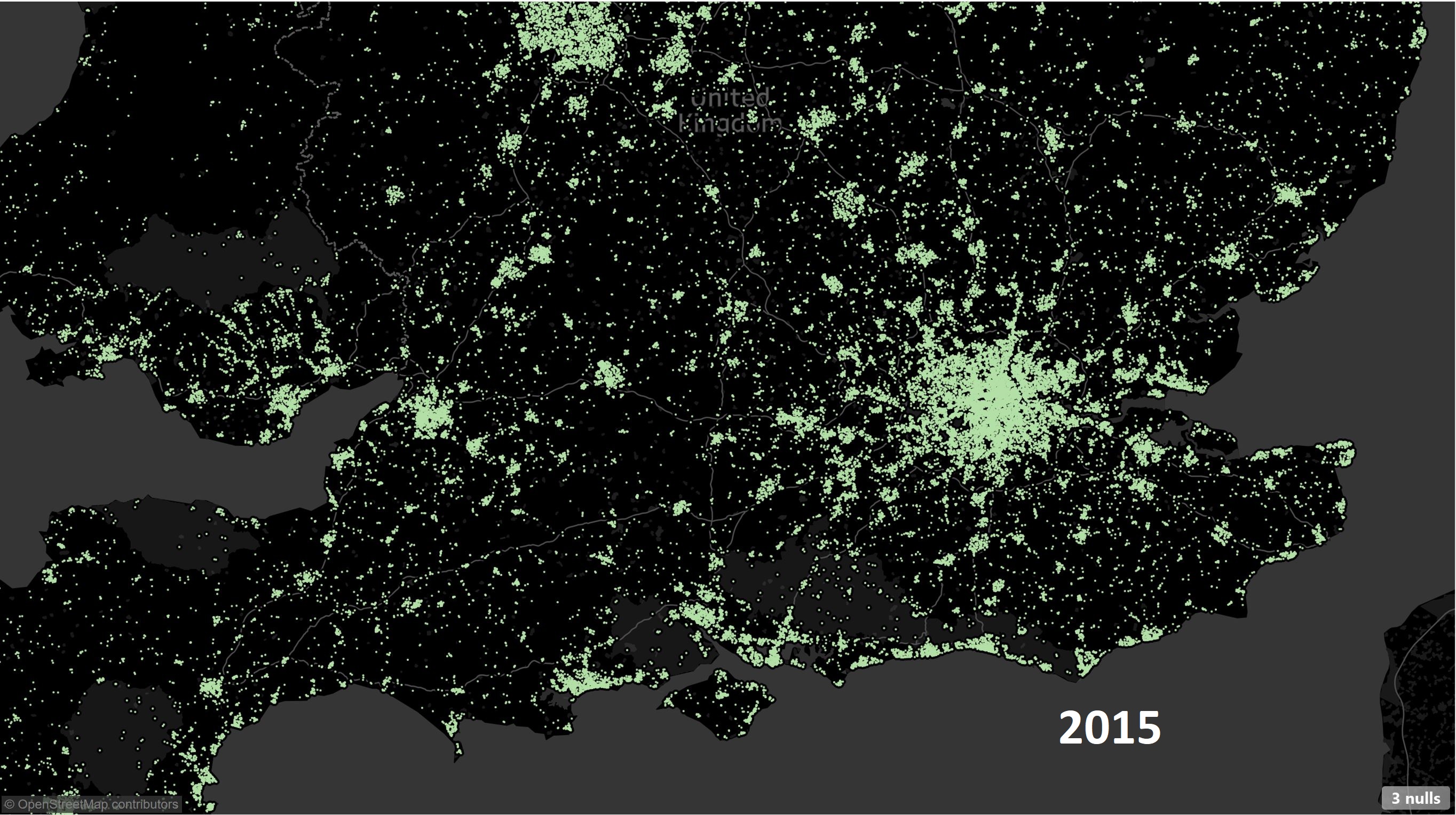
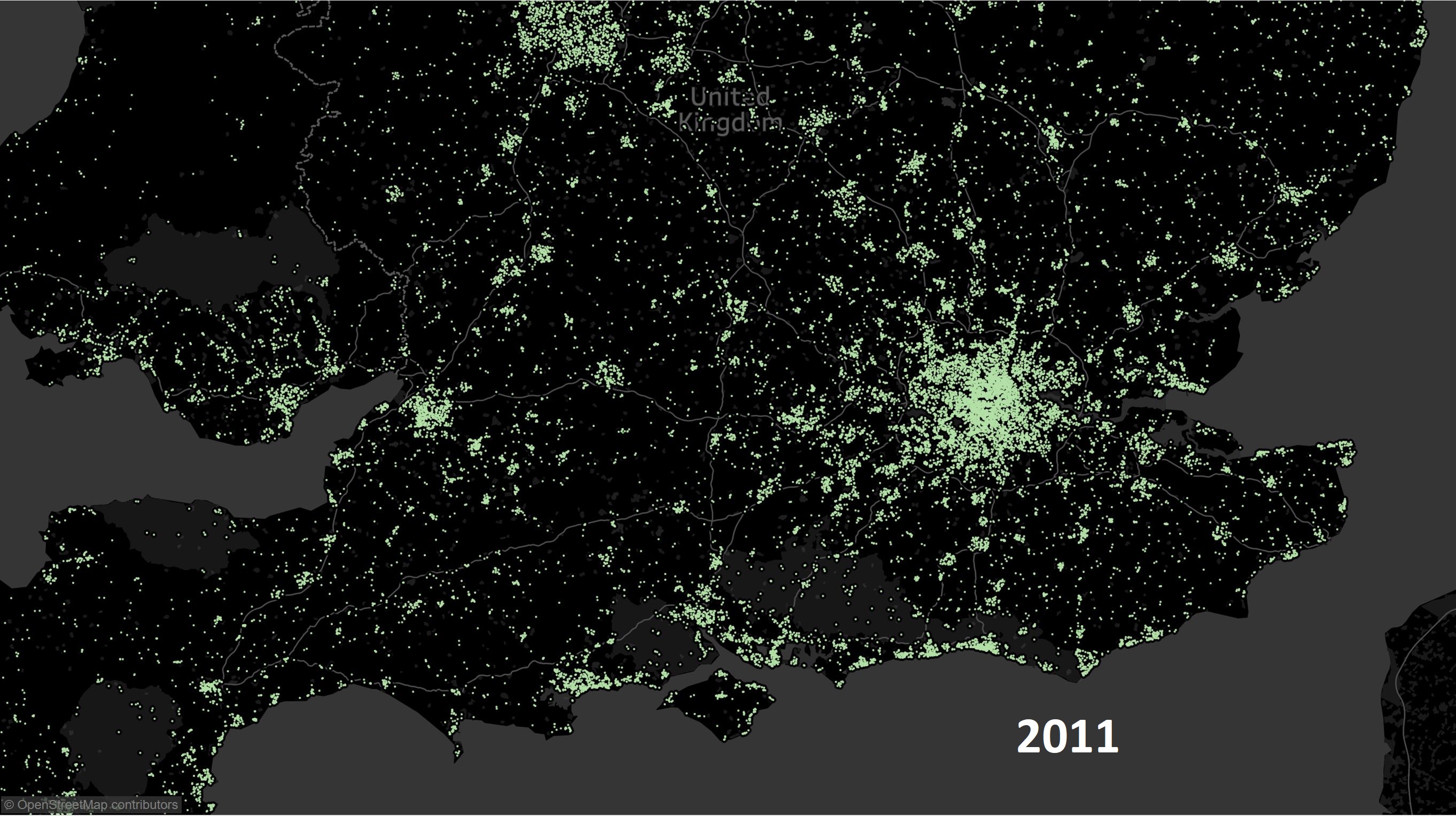 Market recovery starts to gain momentum especially outside London.

 The recovery is now fairly widespread thanks to various initiative by the Government, rock bottom interest rates and a generally positive feeling about the future.
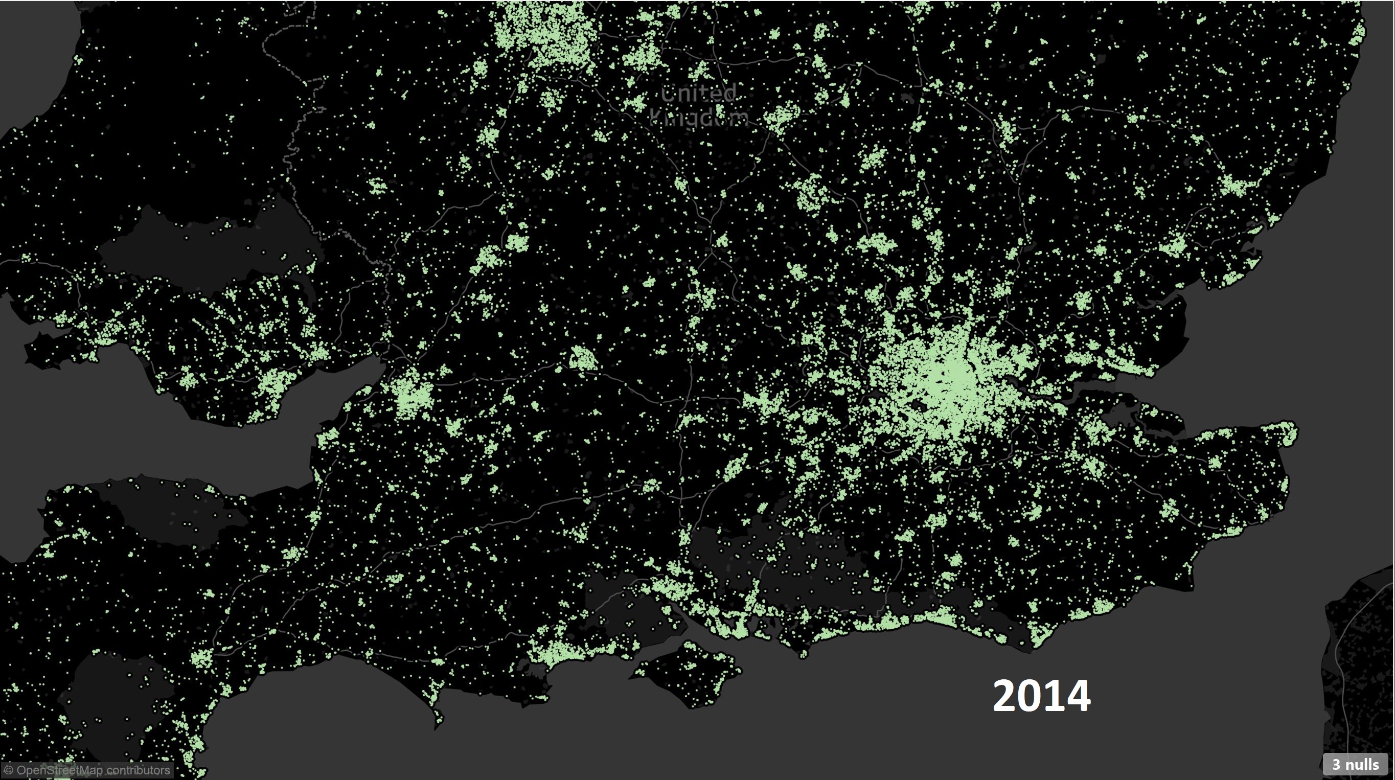
 Brexit and other factors kick in – the main issue is around ‘buy-to-let’ properties which are made less lucrative thanks to three-pronged attack: increase in stamp duty on a second house, removal of tax breaks for landlords and tightening of lending for a second home (especially interest-only mortgages).
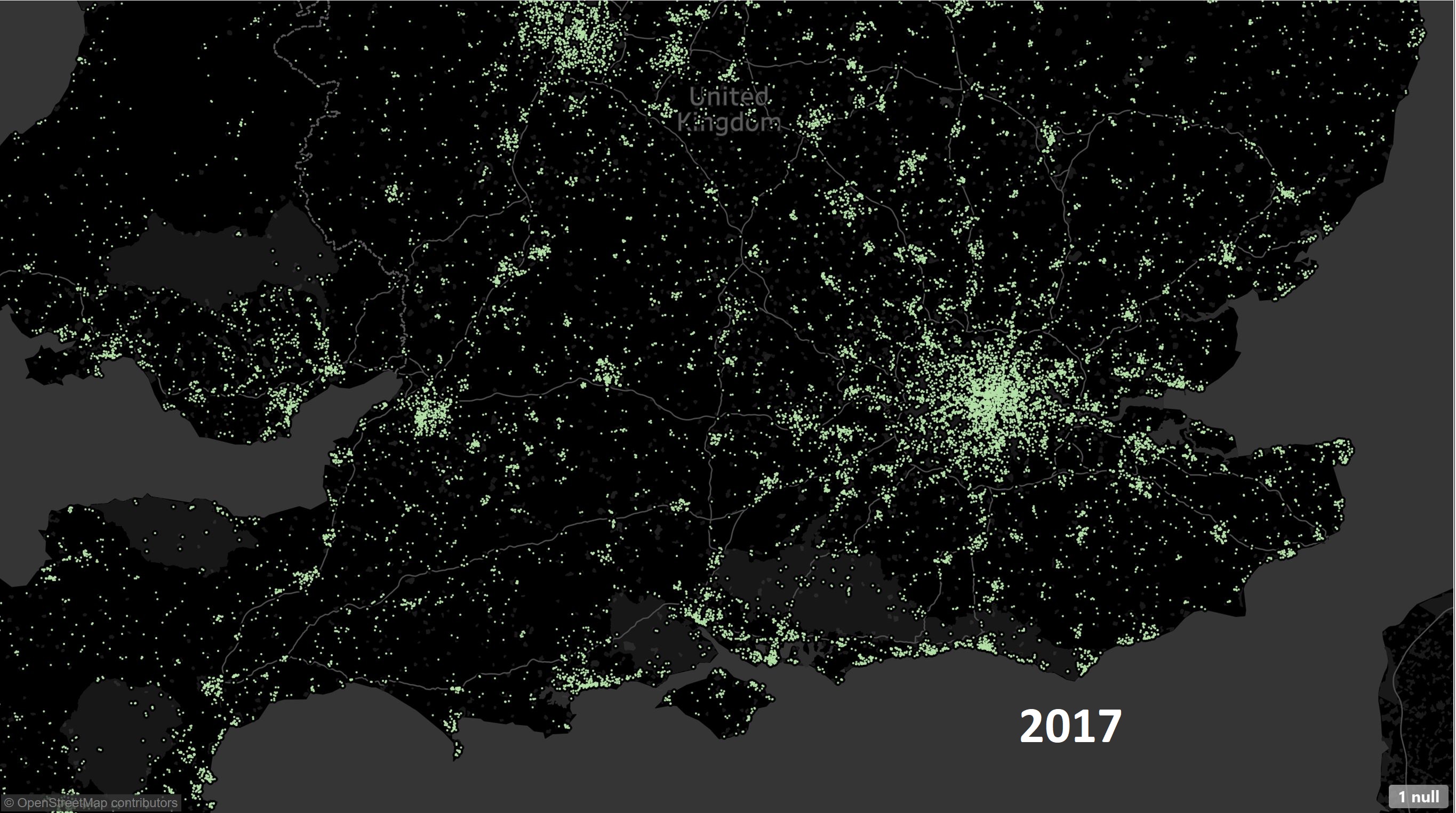
Finally 2017 once can see that the market is again cooling down. Latest data suggests house prices have started falling once again and with the recent rise in interest rates it will make landing a good deal on a mortgage all that more difficult.
Average House Prices
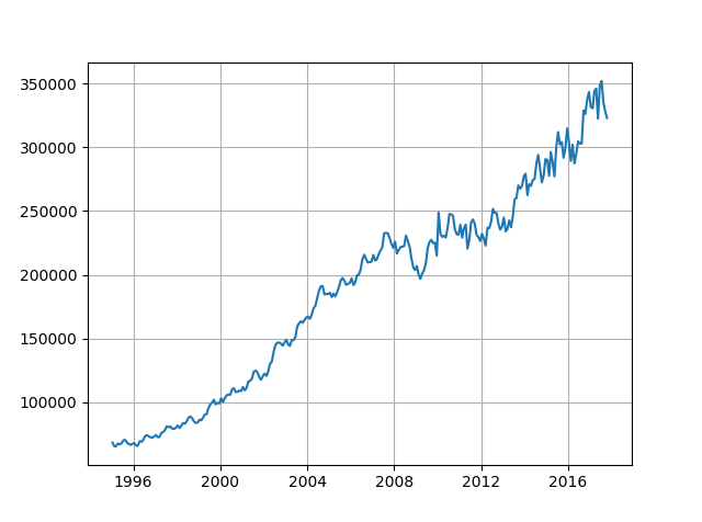
Above graph shows how the Average price of Sales has changed over the Years. We see there is a slump in prices starting from 2017. It will be interesting to see how the house prices behave as we start 2018. It will be a challenge for people to afford higher mortgages as inflation outstrips income growth. This is especially true for first-time buyers. Given the recent bonanza of zero percent stamp duty for first time buyers I am not sure how much of an impact (positive) this will have.
Returns on Properties
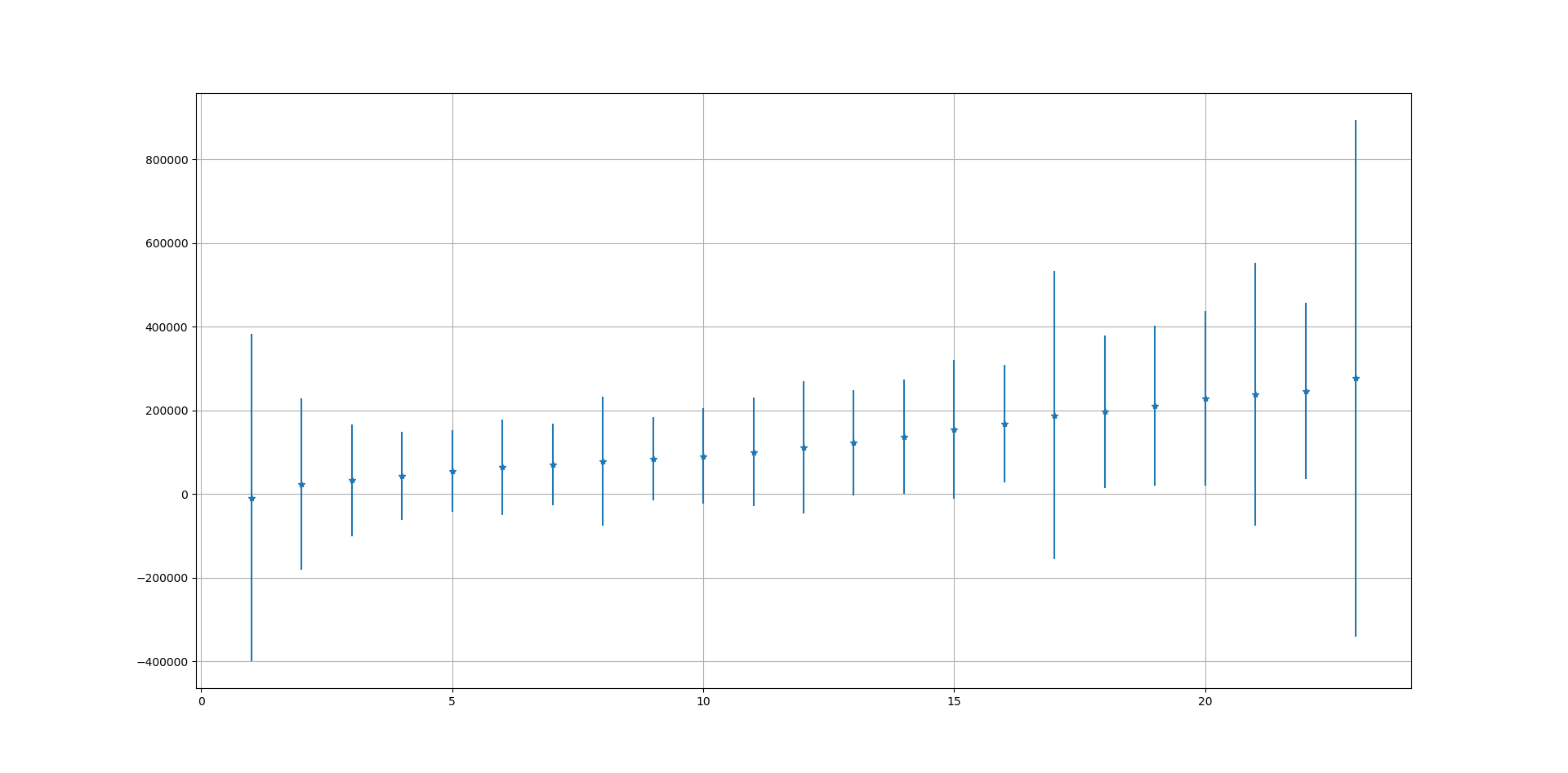
Above graph shows how the returns and risks associated with a house change after a given number of years. It is clear that it is easier to get a return when a house is held for at least 5 years. Below that there is a risk of loosing money on the property. Properties resold within two years are most likely to make a loss. This also ties in with a ‘distress’ sale scenario where the house is sold without waiting for the best possible offer or in times of slowdown where easy term mortgages are not available.
Number of Times Re-sold
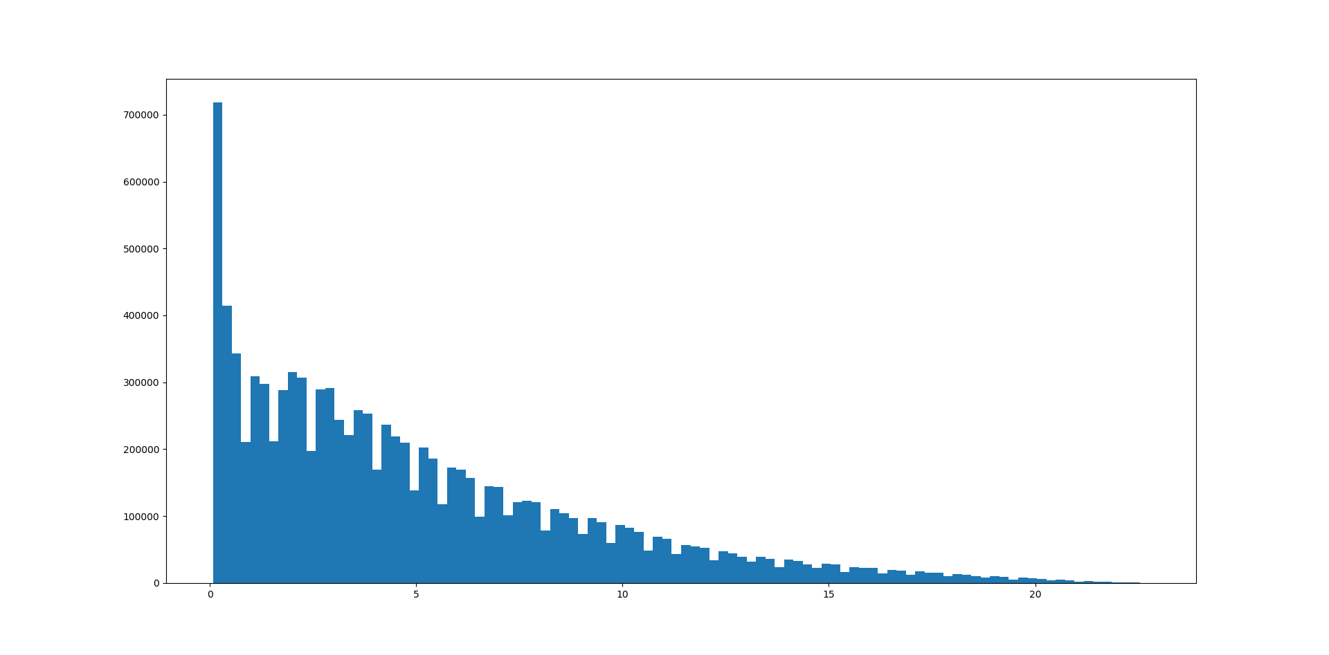
Above graph shows the number of times a house is re-sold (vertical) against the number of years it is held for before being re-sold. Most houses are re-sold within 5 years. But why a massive spike where houses are re-sold within 2 years? One possible explanation is that these are houses that are bought by a developer, improved and then re-sold within a year or so.
House Transactions by Month of Year
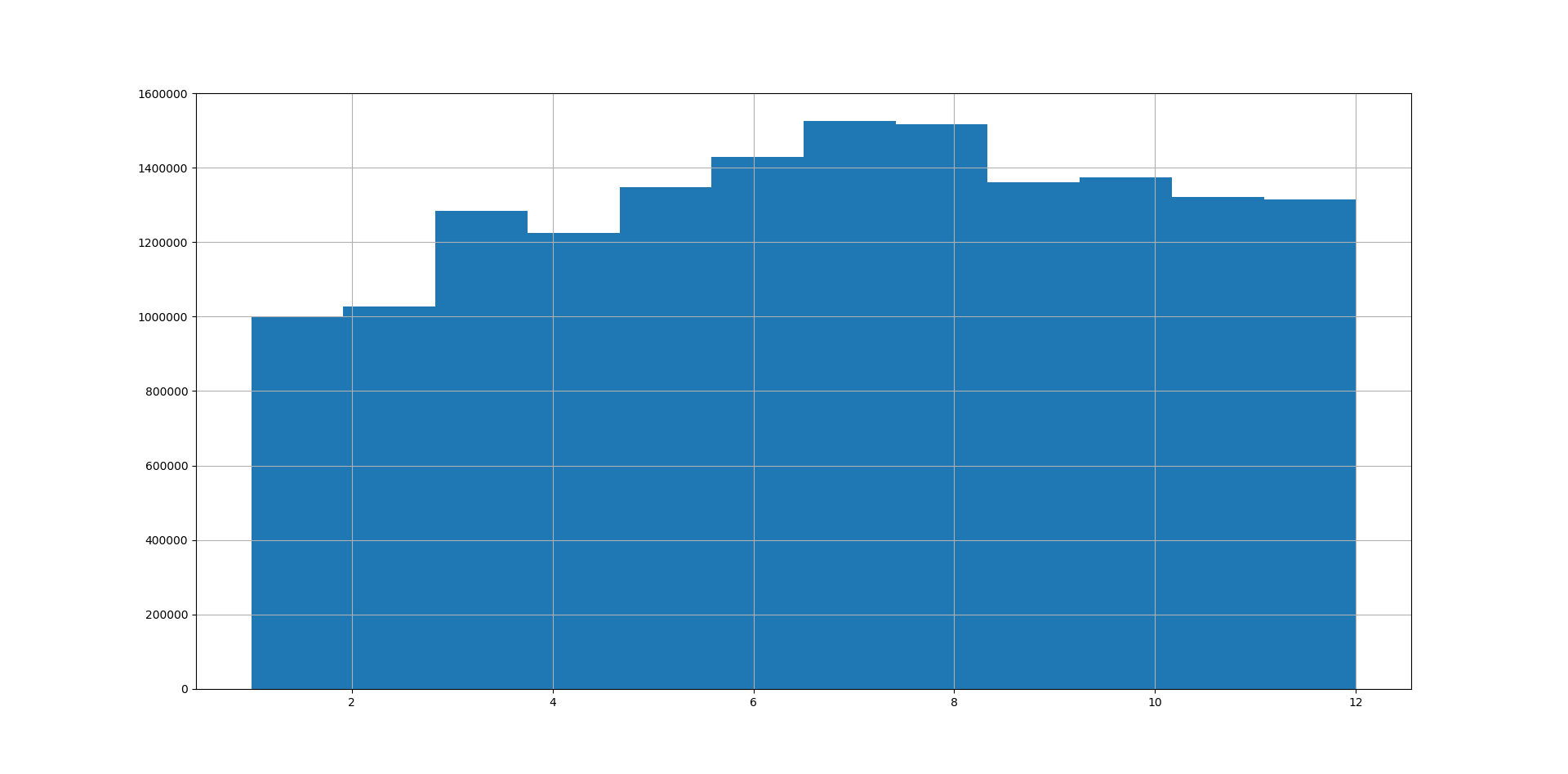
What is the best time of the year to sell your house? Counting number of transactions by month (figure above) we can see number of transactions increases as Spring starts and continues to grow till the end of Summer. In fact 60% more houses are sold in Jun – Aug period as compared to Jan – March.
Transactions tend to decrease slightly as Autumn starts and falls off towards end of the year. This is expected as people would not want to move right after Christmas or early in the new year (winter moves are difficult!)
Infrastructure
I have used Apache Spark (using Java) to summarise the data from approximately 4 GB to 1-1.5 GB CSV files and then Python to do next round of aggregations and to generate the plots.
Next step will be to incorporate some Machine Learning into the process.
