The house prices in UK are at it again. A combination of Brexit, change in housing stock, easy loans and growing consumer debt is making things interesting again.

Figure 1 shows the number of transactions every month since 1995. The massive fall post 2007 because of the financial crisis. Then the surge in transactions since 2013. The lonely spot (top-right, March 2016) is just before the new Stamp Duty changes made buying a second house an expensive proposition. But this is relatively boring!
Visual Analytics: Relation between Quantity and Value of Transactions
Let us look at Transaction Count (quantity) and Total Value of those transactions, aggregated on a monthly basis. I used a Spark cluster to aggregate the full transaction set (4GB csv data file). The base data set has about 280 rows with the following structure:
{month, year, sum, count}The month and year values are converted into dates and added to the row, then the data set is sorted by date:
{date, month, year, sum, count}This leads us to three plots. Sum and Count against time and Sum against Count. These are shown below:

Figure 2 shows Total Transaction value by date (Y-axis). The plot is grouped by year where each dot represents a month in that year. The current year (2018) has complete months data till August therefore less number of dots.

Figure 3 shows Total Quantity of Transactions (Y-axis), once again grouped by year. Similar to Figure 2 the data is complete till August 2018.

Figure 4 show how the value of the transactions relates to number of transactions. Each dot represents a month in a year. As expected there is a slightly positive correlation between total value of transactions and the number of transactions. A point to note: the total value of transactions depends on the sale price (that depends on the property sold) as well as the number of transactions in a given month. For the same number of transactions the value could be high or low (year on year) depending on whether prices are inflationary or a higher number of good quality houses are part of that months transactions.

Figure 5 enhances Figure 4 by using colour gradient to show the year of the observation. Each year should have at least 12 points associated with it (except 2018). This concept is further extended by using different shape for the markers depending on whether that observation was made before the financial crisis (circle: year of observation before 2008), during the financial crisis (square: year of observation between 2008 and 2012) or after the crisis (plus: year of observation after 2012). These values for years have been picked using Figures 2 and 3.

Figure 6 shows the effect of the financial crisis nicely. The circles represent pre-crisis transactions. The squares represent transactions during the crisis. The plus symbol represents post-crisis transactions.
The rapid decrease in transactions can be seen as the market contracted in 2007-2008. As the number of transactions and the value of transactions starts falling, the relative fall in number of transactions is larger than in the total value of the transactions. This indicates the prices did fall but mostly not enough houses were being sold. Given the difficulty in getting a mortgage, this reduction in number of transactions could be caused by a lack of demand.
Discovering Data Clusters
Using a three class split (pre-crisis, crisis, post-crisis) provides some interesting results. These were described in the previous section. But what happens if a clustering algorithm is used on the data?
A Clustering algorithm attempts to assign each observation to a cluster. Depending on the algorithm, total number of clusters may be required as an input. Clustering is often helpful when trying to build initial models of the input data especially when no labels are available. In that case, the cluster id (represented by the cluster centre) becomes the label. The following clustering algorithms were evaluated:
- k-means clustering
- gaussian mixture model
The data-set for the clustering algorithm has three columns: Date, Monthly Transaction Sum and Monthly Transaction Count.
Given the claw mark distribution of the data it was highly unlikely k-means would give good results. That is exactly what we see in Figure 7 with cluster size of 3 (given we had three labels previously of before crisis, during crisis and after crisis). The clustering seems to cut across the claws.
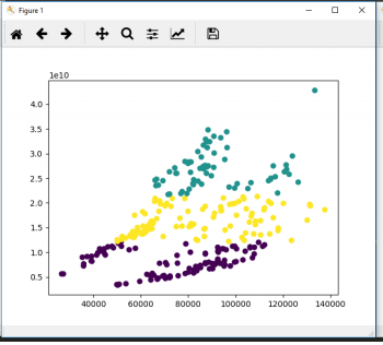
If a gaussian mixture model (GMM) is used with component count of 3 and covariance type ‘full’ (using sklearn implementation – see code below) some nice clusters emerge as seen in Figure 8.
Each of the components corresponds to a ‘band’ in the observations. The lowest band corresponds loosely with pre-crisis market, the middle (yellow) band somewhat expands the crisis market to include entries from before the crisis. Finally, the top-most band (green) corresponds nicely with the post-crisis market.
But what other number of components could we choose? Should we try other GMM covariance types (such as ‘spherical’, ‘full’, ‘diag’, ‘tied’)? To answer these questions we can run a ‘Bayesian Information Criteria’ test against different number of components and different covariance types. The method and component count that gives the lowest BIC is preferred.
The result is shown in Figure 9.
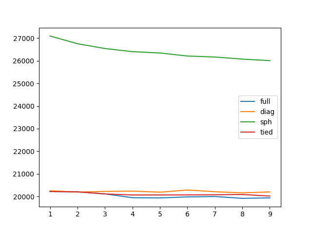
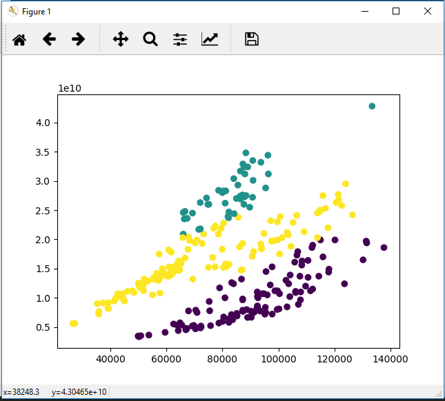
From Figure 9 it seems the ‘full’ type consistently gives the lowest BIC on the data-set. Furthermore, going from 3 to 4 components improves the BIC score (lower the better). Another such jump is from 7 to 8. Therefore, number of components should be 4 (see Figure 10) or 8 (see Figure 11).
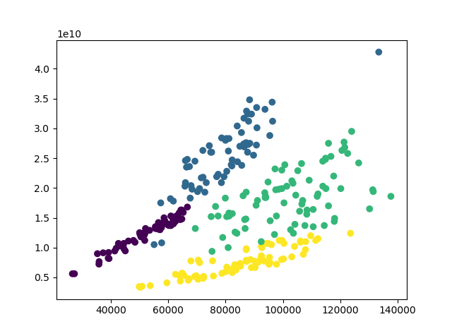

Figure 11: Transaction value (Y-axis) against Total Number of Transactions – with 8 components.
The 4 component results (Figure 10) when compared with Figure 5 indicates an expansion at the start of the data-set (year: 1995), this is the jump from yellow to green. Then during the crisis there is a contraction (green to purple). Post crisis there is another expansion (purple to blue). This is shown in Figure 12.

The 8 component results (Figure 11) when compared with Figure 5 shows the stratification of the data-set based on the Year value. Within the different colours one can see multiple phases of expansion and contraction.
The interesting thing is that for both 4 and 8 component models, the crisis era cluster is fairly well defined.
Code for this is given below:
from matplotlib import pyplot as plt
from pandas import DataFrame as df
from datetime import datetime as dt
from matplotlib.dates import YearLocator, MonthLocator, DateFormatter
import pandas as pd
import numpy as np
from sklearn.cluster import KMeans, MiniBatchKMeans, DBSCAN
from sklearn.mixture import GaussianMixture


csv = "c:\\ML Stats\\housing_sep_18_no_partial_mnth_cnt_sum.csv"


df = pd.read_csv(csv)


dates = list(map(lambda r: dt(int(r[1]["Year"]), int(r[1]["Month"]), 15), df.iterrows()))

df_pure = pd.DataFrame({"Date": dates, "Count": df.Count, "Sum": df.Sum, "Year": df.Year})


df_pure = df_pure.sort_values(["Date"])

df_pure = df_pure.set_index("Date")


bics = {}
for cmp in range(1,10):

    clust_sph = GaussianMixture(n_components=cmp, covariance_type='spherical').fit(df_pure)
    clust_tied = GaussianMixture(n_components=cmp, covariance_type='tied').fit(df_pure)
    clust_diag = GaussianMixture(n_components=cmp, covariance_type='diag').fit(df_pure)
    clust_full = GaussianMixture(n_components=cmp, covariance_type='full').fit(df_pure)

    clusts = [clust_full, clust_diag, clust_sph, clust_tied]
    bics[cmp] = []
    for c in clusts:
        bics[cmp].append(c.bic(df_pure))

plt.plot(bics.keys(), bics.values())
plt.legend(["full", "diag", "sph", "tied"])
plt.show()

num_components = 4

clust = GaussianMixture(n_components=num_components, covariance_type='full').fit(df_pure)

lbls = clust.predict(df_pure)

df_clus = pd.DataFrame({"Count": df_pure.Count, "Sum": df_pure.Sum, "Year": df_pure.Year, "Cluster": lbls})
color = df_clus["Cluster"]

fig, ax = plt.subplots()
ax.scatter(df_clus["Count"], df_clus["Sum"], c=color)

fig, ax2 = plt.subplots()
ax2.scatter(df_clus["Year"], df_clus["Count"], c=color)

fig, ax3 = plt.subplots()
ax3.scatter(df_clus["Year"], df_clus["Sum"], c=color)


plt.show()
Contains HM Land Registry data © Crown copyright and database right 2018. This data is licensed under the Open Government Licence v3.0.
