In this post we take a look at the housing market data which consists of all the transactions registered with the UK Land Registry since 1996. So lets get the copyright out of the way:
Contains HM Land Registry data © Crown copyright and database right 2018. This data is licensed under the Open Government Licence v3.0.
The data-set from HM Land Registry has information about all registered property transactions in England and Wales. The data-set used for this post has all transactions till the end of October 2018.
To make things slightly simple and to focus on the price paid and number of transaction metrics I have removed most of the columns from the data-set and aggregated (sum) by month and year of the transaction. This gives us roughly 280 observations with the following data:
{ month, year, total price paid, total number of transactions }
Since this is a simple time-series, it is relatively easy to process. Figure 1 shows this series in a graph. Note the periodic nature of the graph.

The first thing that one can try is auto-correlation analysis to answer the question: Given the data available (till end-October 2018) how similar have the last N months been to other periods in the series? Once we identify the periods of high similarity, we should get a good idea of current market state.
To predict future market state we can use time-series forecasting methods which I will keep for a different post.
Auto-correlation
Auto-correlation is correlation (Pearson correlation coefficient) of a given sample (A) from a time series against other available samples (B). Both samples are of the same size.
Correlation value lies between 1 and -1. A value of 1 means perfect correlation between two samples where they are directly proportional (when A increases, B also increases). A value of 0 implies no correlation and a value of -1 implies the two samples are inversely proportional (when A increases, B decreases).
The simplest way to explain this is with an example. Assume:
- monthly data is available from Jan. 1996 to Oct. 2018
- we choose a sample size of 12 (months)
- the sample to be compared is the last 12 months (Oct. 2018 – Nov. 2017)
- value to be correlated is the Total Price Paid (summed by month).
As the sample size is fixed (12 months) we start generating samples from the series:
Sample to be compared: [Oct. 2018 – Nov. 2017]
Sample 1: [Oct. 2018 – Nov. 2017], this should give correlation value of 1 as both the samples are identical.
Sample 2: [Sep. 2018 – Oct. 2017], the correlation value should start to decrease as we skip back one month.
Sample N: [Dec. 1996 – Jan. 1996], this is the earliest period we can correlate against.
Now we present two graphs for different sample sizes:
- correlation coefficient visualised going back in time, grouped by Year (scatter and box plot per year) – to show yearly spread
- correlation coefficient visualised going back in time – to show periods of high correlation
Thing to note in all the graphs is that the starting value (right most) is always 1. That is when we compare the selected sample (last 12 months) with the first sample (last 12 months).
In the ‘back in time’ graph we can see the seasonal fluctuations in the correlation. These are between 1 and -1. This tells us that total price paid has a seasonal aspect to it. This makes sense as we see lots of houses for sale in the summer months than winter as most people prefer to move when the weather is nice!
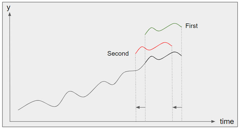
So if we correlate a 12 month period (like this one) one year apart (e.g. Oct. 2018 – Nov. 2017 and Oct. 2017 – Nov. 2016) one should get positive correlation as the variation of Total Price Paid should have the same shape. This is ‘in phase’ correlation. This can be seen in Figure 2 as the ‘first’ correlation which is in phase (in fact it is perfectly in phase and the values are identical – thus the correlation value of 1).
Similarly, if the comparison is made ‘out of phase’ (e.g. Oct. 2018 – Nov. 2017 and Jul 2018 – Aug. 2017) where variations are opposite then negative correlation will be seen. This is the ‘second’ correlation in Figure 2.
This is exactly what we can see in these figures. Sample sizes are 6 months, 12 months, 18 months and 24 months. There are two figures for each sample size. The first figure is the spread of the auto-correlation coefficient for a given year. The second figure is the time series plot of the auto-correlation coefficient, where we move back in time and correlate against the last N months. The correlation values fluctuating between 1 and -1 in a periodic manner.

Fig. 3a: Correlation coefficient visualised going back in time, grouped by Year (scatter and box plot per year), Sample size: 6 months

Fig. 3b: Correlation coefficient visualised going back in time; Sample size: 6 months

Fig. 4a: Correlation coefficient visualised going back in time, grouped by Year (scatter and box plot per year); Sample size: 12 months

Fig. 4b: Correlation coefficient visualised going back in time; Sample size: 12 months

Fig. 5a: Correlation coefficient visualised going back in time, grouped by Year (scatter and box plot per year); Sample size: 18 months

Fig. 5b: Correlation coefficient visualised going back in time; Sample size: 18 months

Fig. 6a: Correlation coefficient visualised going back in time, grouped by Year (scatter and box plot per year); Sample size: 24 months

Fig. 6b: Correlation coefficient visualised going back in time; Sample size: 24 months
Conclusions
Firstly, if we compare the scatter + box plot figures, especially for 12 months (Figure 4a), we find the correlation coefficients are spread around ‘0’ for most of the years. One period where this is not so and the correlation spread is consistently above ‘0’ is the year 2008, the year that marked the start of the financial crisis. The spread is also ‘tight’ which means all the months of that year saw consistent correlation, for the Total Price Paid, against the last 12 months from October 2018.
Secondly conclusion we can draw from the positive correlation between last 12 months (Figure 2b) and the period of the financial crisis is that the variations in the Total Price Paid are similar (weakly correlated) with the time of the financial crisis. This obviously does not guarantee that a new crisis is upon us. But it does mean that the market is slowing down. This is a reasonable conclusion given the double whammy of impending Brexit and on set of winter/Holiday season (which traditionally marks a ‘slow’ time of the year for property transactions).
Code is once again in python and attached below:
from matplotlib import pyplot as plt
from pandas import DataFrame as df
from datetime import datetime as dt
from matplotlib.dates import YearLocator, MonthLocator, DateFormatter
import pandas as pd
import numpy as np
from sklearn.cluster import KMeans, MiniBatchKMeans, DBSCAN
from sklearn.mixture import GaussianMixture

months = MonthLocator(range(1, 13), bymonthday=1, interval=3)
year_loc = YearLocator()

window_size = 12

def is_crisis(year):
    if year<2008:
        return 0
    elif year>2012:
        return 2

    return 1

def is_crisis_start(year):
    if year<2008:
        return False
    elif year>2008:
        return False

    return True

def process_timeline(do_plot=False):
    col = "Count"
    y = []
    x = []
    x_d = []
    box_d = []
    year_d = []
    year = 0
    years_pos = []
    crisis_corr = []
    for i in range(0, size - window_size):

        try:

            if year != df_dates["Year"][size-1-i]:

                if year > 0:
                    box_d.append(year_d)
                    years_pos.append(year)
                year_d = []
                year = df_dates["Year"][size-1-i]

            corr = np.corrcoef(df_dates[col][size -i - window_size: size - i].values, current[col].values)
            year_d.append(corr[0, 1])
            y.append(corr[0, 1])
            if is_crisis_start(year):
                crisis_corr.append(corr[0, 1])
            x.append(year)
            month = df_dates["Month"][size - 1 - i]
            x_d.append(dt(year, month, 15))

        except Exception as e:
            print(e)

    box_d.append(year_d)
    years_pos.append(year)

    corr_np = np.array(crisis_corr)
    corr_mean = corr_np.mean()
    corr_std = corr_np.std()

    print("Crisis year correlation: mean and std.: {} / {} ".format(corr_mean, corr_std))
    if do_plot:

        fig, sp = plt.subplots()

        sp.scatter(x, y)
        sp.boxplot(box_d, positions=years_pos)

        plt.show()

        fig, ax = plt.subplots()
        ax.plot(x_d, y,'-o')
        ax.grid(True)
        ax.xaxis.set_major_locator(year_loc)
        ax.xaxis.set_minor_locator(months)
        plt.show()

    return corr_mean, corr_std

csv = "c:\\ML Stats\\housing_oct_18_no_partial_mnth_cnt_sum.csv"
full_csv = "c:\\ML Stats\\housing_oct_18.csv_mnth_cnt_sum.csv"

df = pd.read_csv(full_csv)


mnth = {
    1: "Jan",
    2: "Feb",
    3: "Mar",
    4: "Apr",
    5: "May",
    6: "Jun",
    7: "Jul",
    8: "Aug",
    9: "Sep",
    10: "Oct",
    11: "Nov",
    12: "Dec"
}


dates = list(map(lambda r: dt(int(r[1]["Year"]), int(r[1]["Month"]), 15), df.iterrows()))

crisis = list(map(lambda r: is_crisis(int(r[1]["Year"])), df.iterrows()))

df_dates = pd.DataFrame({"Date": dates, "Count": df.Count, "Sum": df.Sum, "Year": df.Year, "Month": df.Month, "Crisis": crisis})

df_dates = df_dates.sort_values(["Date"])

df_dates = df_dates.set_index("Date")

plt.plot(df_dates["Sum"],'-o')
plt.ylim(ymin=0)
plt.show()

size = len(df_dates["Count"])

corr_mean_arr = []
corr_std_arr = []
corr_rat = []
idx = []
for i in range(0, size-window_size):
    end = size - i
    current = df_dates[end-window_size:end]
    print("Length of current: {}, window size: {}".format(len(current), window_size))

    ret = process_timeline(do_plot=True)
    break #Exit early
