Large language models are complex constructs that can understand and generate language – made up of a token-probability map generator and the next token selector which uses that map to select the next token. We will explore the structure of Large LanguageModels (LLMs) using the transformers python library provided by HuggingFace.
The token generator part is the gazillion-parameter, heavy weight, neural network based, language model. We create it as below, where the ‘model’ object encapsulates the LLM:
There are different model objects associated with each model type. In the above example we are loading a version of the GPT2 model using the ‘from_pretrained’ convenience method.
The token probabilities for the next token are obtained by performing a forward pass through the model as above.
The output will be shaped according to the vocabulary size and output size of the model (e.g., 50,257 for GPT2 and 32,000 for Llama2). If we do some processing of the output and map it against the index in the ‘vocab.json’ associated with the model, we can get a probability map of tokens like below (from GPT2). The screenshot shows the token index and its probability score and text value:
The token generator and selector parts are conveniently encapsulated in the generate method associated with the model object:
The selector uses searching and sampling mechanisms (e.g., top-k/top-p sampling and beam search) to select the next token. This component is what provides the mechanism to inject variation in the generated output. The model itself doesn’t provide any variability. The forward pass will predict the same same set of next tokens given the same input.
The forward pass is repeated again by adding the previously generated token to the input (for auto-regressive models like GPT) which allows the response to ‘grow’ one token at a time. The generate method takes care of this looping under the hood. The max_length parameter controls the number of times this looping takes place (and therefore the length of the generated output).
Embeddings allow non-numeric data such as graphs and text to be passed into neural networks for use-cases such as machine translation. Embeddings map the non-numeric data into a set of numbers that preserve some/all of the properties of the original data.
Let us start with a simple example: we want to translate a single word from one language to another (say English to German). The model will have three parts – an encoder that maps an English word to a point in an abstract numeric space, a ‘decoder’ that maps a point from another numeric space to a German word, and a translator that maps the ‘English’ numeric space to the ‘German’ numeric space.
Encoder: [hat] -> [42]
Translation: [42] -> [100]
Decoder: [100] -> [Hut]
Remember the requirement that some/all of the properties must be preserved when moving to the numeric space? In the example above, for ’42’ to be an embedding and not just an encoding it should reflect the meaning of the word ‘hat’. In a numeric space that has preserved the ‘meaning’ we expect that the numbers for ‘hat’ and ‘cap’ should be close to each other and the number for the word ‘elephant’ should be far away.
In case of images, we would expect embeddings of the different images of hand-written ‘1’ to be close to each other and those for ‘2’ to be far away. Embeddings for ‘7’ might be closer as hand-written ‘7’ can look like a ‘1’.
Generating Embeddings
Training your own embedding generator for the English language is relatively easy as you have lots of free data available. You can use the Book Corpus dataset (https://huggingface.co/datasets/bookcorpus) that consists of 5gb of extracts from books.
To prepare the data for to train the encoder-decoder network you will need a tokenizer which converts a string of words into a string of numeric tokens. I used the freely available GPT2 tokenizer from Huggingface.
During the training process, tokens are then passed through the encoder-decoder network where we attempt to:
train the encoder part to generate an embedding that represents the input string.
train the decoder part to ‘recreate’ the input token string from the generated embedding.
The resulting trained encoder-decoder pair can then be separated (think of breaking a chocolate bar in half) and just the encoder part be used to generate embeddings.
Let us see with an example.
The first step is to tokenize the input string:
‘I love pizza’ -> tokenize -> [45, 54, 200]
Then to train the encoder-decoder pair so that input can be recreated by decoder at the other end:
In the example above the generated embeddings have 2-dimensions (easier to visualise) with the value of [4, 6]. This when passed to the decoder should generate a token string that is same as the input.
The neural network usually looks like the figure ‘8’ with the embedding output found in the narrow ‘waist’.
For my example I used a max sentence length of 1024 words. Embedding dimension of 2 (to make it easier to visualise). Input layer of 1024, with three encoder layers: 500, 200 and 2. Mirroring that the decoder with 2, 200, 500 layers and a final output layer of 1024.
Training took 2 days to complete on my laptop.
Output Examples
Figure 1: Plotting single word embeddings.
Figure 1 shows single words put through the encoder and the resulting embedding. Two dimensional embeddings allow easy visualisation of the embedding points. We can see some clusters for Countries and Animals and the merging of the two clusters for ‘Cat’ and ‘India’. Clearly we are getting some ‘meaning’ of the word translating to the embedding but it is far from perfect.
Figure 2: Plotting phrase embeddings.
In Figure 2 we can see the output of phrase embeddings. We see a cluster of phrases around ‘England’ but then an outlier that talks about the London being the capital of England. Other clusters can be seen around Animal phrases and Country phrases. This again is far from perfect.
The main thing I want to highlight is that with minimal effort preparing the data and training the encoder model, it has extracted some concept of ‘meaning’ and this property is translated into the embedding space. Similar phrases are showing up closer to each other in the numeric embedding space. This is after 2 days of training a relatively small model on a low-powered laptop.
A question that arises is ‘how did it learn the meaning’. The answer is relatively straightforward. It did not learn the actual meaning. It learned the relationships between words based on their occurrence in the training data set. This is why large language models cannot be used in a raw state because the data they are used to train with may have all kinds of skewed subsets that lead to things like gender bias.
Imagine training larger models on more powerful infrastructure. Well, you don’t need to imagine, we can already see the power of GPT-4 which took months to train on highly specialized hardware (Nvidia GPUs).
The focus in AI is all about Machine Learning – training larger models with more data and then showcasing how that model performs on tests. This is testing two main aspects of the model:
Ability to recall relevant information.
To organize and present the relevant information so that it resembles human generated content.
But no one is talking about the ability to forget information and to ignore information that is not relevant or out of date.
Reasons to Forget
Forgetting is a natural function of learning. It allows us to learn new knowledge, connect new knowledge with existing (reinforcement) and deal with the ever increasing flood of information as we grow older.
For Machine Learning models this is a critical requirement. This will allow models to keep learning without it taking more time and effort (energy) as the body of available knowledge grows. This will also allow models to build their knowledge in specific areas in an incremental way.
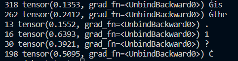
ChatGPT has a time horizon of September 2021 and has big gaps in its knowledge. Imagine being 1.5 years behind in today’s day and age [see Image 1].
Image 1: Gaps in ChatGPT.
Reasons to Ignore
Machine learning models need to learn to ignore. This is something humans do naturally, using the context of the task to direct our attention and ignore the noise. For example, doctors, lawyers, accountants need to focus on the latest available information in their field.
When we start to learn something new we take the same approach of focusing on specific items and ignoring everything else. Once we have mastered a topic we are able to understand why some items were ignored and what are the rules and risks of ignoring.
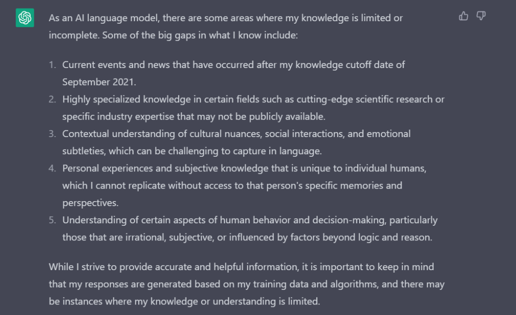
Current transformer models have an attention mechanism which does not tell us what to ignore and why. The ‘why’ part is very important because it adds a level of explainability to the output. For example the model can end up paying more attention to the facts that are incorrect or no longer relevant (e.g. treatments, laws, rules) because of larger presence in the training data. If it was able to describe why it ignored related but less repeated facts (or the opposite – ignore repeated facts in favor of unique ones – see Image 2 below) then we can build specific re-training regimes and knowledge on-boarding frameworks. This can be thought of as choosing between ‘exploration’ and ‘exploitation’ of facts.
Image 2: ChatGPT giving wrong information about Queen Elizabeth II, which is expected given its limitations (see Image 1), as she passed away in 2022.
Image 2: Incorrect response – Queen Elizabeth II passed away in 2022.
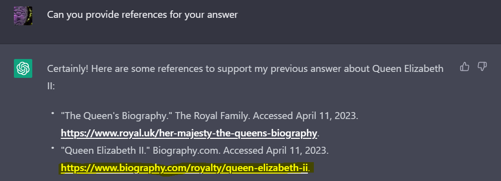
Image 3: Asking for references used and ChatGPT responding with a few valid references (all accessed on the day of writing the post as part of the request to ChatGPT). Surely, one of those links would be updated with the facts beyond 2021. Let us investigate the second link.
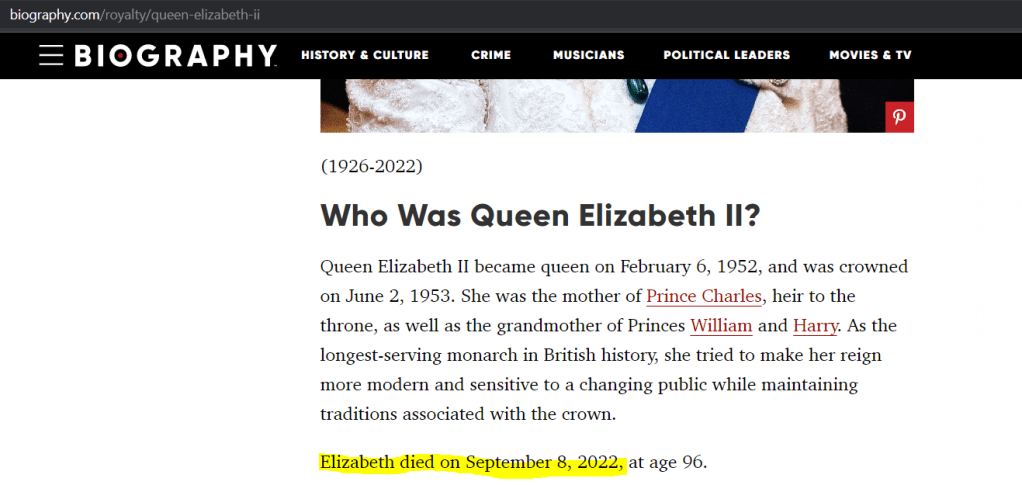
Image 4: Accessing the second link we find updated information about Queen Elizabeth II that she passed away in 2022. If I was not aware of this fact I might have taken the references at face value and used the output. ChatGPT should have ignored what it knew from its training in favor of newer information. But it was not able to do that.
Image 4: Information from one of the links provided as reference.
What Does It Mean For Generative AI?
For agile applications where LLMs and other generative models are ubiquitous we will need to allow these models to re-train as and when required. For that to happen we will need a mechanism for the model to forget and learn in a way that builds on what was learnt before. We will also need the model to learn to ignore information.
With ML Models we will also need a way of validating/confirming that the right items have been forgotten. This points to regular certification of generative models especially those being used in regulated verticals such as finance, insurance , healthcare and telecoms. This is similar to certification regimes in place for financial advisors, doctors etc.
Looking back at this article – it is simply amazing that we are talking about Generative AI in the same context as human cognition and reasoning!
Money worries are back. In response to rising inflation in the UK, Bank of England has been forced to increase the base rate to 4.25%. That is expected to squeeze demand in two ways:
Improving savings rate to encourage people to spend less and save more
Increasing cost of borrowing – making mortgages more expensive
If you are worried about making money stretch till the end of the month then the first thing to do is: understand your spending.
The best way to understand your spending is to look at your sources of money. Generally, people have two sources:
Income – what we earn
Borrowing – what we borrow from one or more credit products
It is important to understand credit cards are not the only credit product out there. Anything that allows you to buy now and pay later is a credit product – even if they don’t charge interest.
Understand your Income and Expenses
Go to your bank account or credit-card app to understand how much money you get in each month, how much of it is spent and how much do you borrow over that amount. Most modern banking apps allow you to download transactions in comma separated values (csv) format or as an excel sheet. Many also have spending analytics that allow you to investigate the flow of money.
Once you have downloaded the data you just need to extract 4 items and start building your own expense tracker (see Excel sheet below).
Four pieces of information are important here:
Date of Transaction
Amount (with indication of money spent or earned)
Categorization of the Transaction
Description (optional) – to help categorize the transaction to allow you to filter
For the Categorization I like to keep it simple and just have three categories:
Essential – this includes food, utilities (including broadband, mobile), transport costs, mortgage, insurance, essential childcare, small treats, monthly memberships. This is essential for your physical well-being (i.e. basic food, shelter, clothes, medicine) as well as mental and emotional well-being (i.e. entertainment, favorite food etc. as an occasional treat).
Non-essential – this includes bigger purchases (> £20) such as dining out, more expensive entertainment, travel etc. that we can do without.
Luxury – this includes purchases > £100 which we can do without.
The Excel sheet below will help you track your expenses. The highlighted items are things that you need to provide.
The items that you need to provide (highlighted in the sheet) are:
Transaction data from your bank and credit-card (Columns A-D), this should be for at least 3 months – this is time consuming the first time as you will have to go through and mark each entry as category 1, 2 or 3 (see above). One you do it for historic data you can then maintain it with minimal effort for new data.
Timespan of the data in months
Income
This will generate the expenses in each category on a total and monthly basis (to help you budget).
This will also generate, based on the income provided, the savings you can target each month.
Note: All results are in terms of the currency used for Income and the Transaction records.
Things To Do
Once you understand what you are spending in the three categories you can start forecasting by taking monthly average spending in each category.
Tracking how monthly average changes over a few months will tell you the variance in your spending. Generally, spending rises and falls as the year progresses (e.g. rising sharply before festive periods like Christmas and Diwali and falling right after).
You can do advanced things like factor for impact of inflation on your monthly spending and savings.
Finally, once you have confidence in the output – you can move items between categories. This will allow you to play what-if and understand the impact of changing your spending patterns on your monthly expenses and savings.
The Legal System is all about settling disputes. Disputes can be between people or between a person and society (e.g. criminal activity), can be a civil matter or a criminal one, can be serious or petty. Disputes end up as one or more cases in one or more courts. One dispute can spawn many cases which have to be either withdrawn or decided, before the dispute can be formally settled.
With generative AI we can actually treat the dispute as a whole rather than fragment it across cases. If you look at ChatGPT it supports a dialog. The resolution of a dispute is nothing but a long dialog. In the legal system, this dialog is encapsulated in one or more cases. The dialog terminates when all its threads are tied up in one or more judgments by a judge.
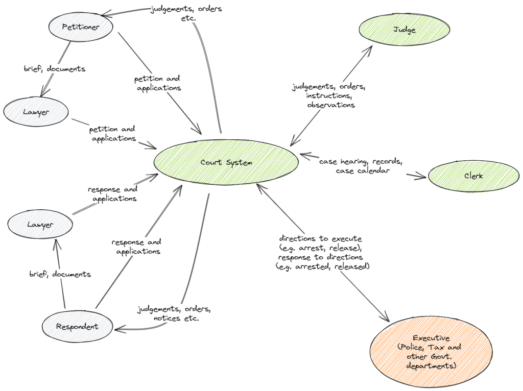
The legal process is heavily based on human-human interaction. For example, the interaction between client-lawyer, lawyer-judge, with law enforcement and so on. This interaction is based on documentation. For example, client provides a brief to a lawyer, lawyer and client together create a petition or a response which is examined by the judge, judge provides judgments (can take many forms such as: interim, final, summary etc.), observations, directions, summons etc. all in form of documents that are used to trigger other processes often outside the court system (such as recovery of dues, arrests, unblocking sale of property etc.). Figure 1 highlights some of the main interactions in the legal system.
Figure 1: High-level interactions in the court system.
Impact of Generative AI
To understand the impact of Generative AI, the key metric to look at are: cost and the case backlog. Costs include not only costs of hiring legal representation but also costs associated with the court system. This includes not only the judges and their clerks, but also administration, security, building management and other functions not directly related to the legal process. Time can also be represented as a cost (e.g. lawyers fees). Longer a case takes more expensive it becomes not only for the client but also for the legal system.
The case backlog here means the number of outstanding cases. Given the time taken to train new lawyers and judges, and to decide cases, combined with a growing population (therefore more disputes), it is clear that as number of cases will rise faster than they can be decided. Each stage requires time for preparation. Frivolous litigation and delay tactics during the trial also impacts the backlog. Another aspect that adds to the backlog is the appeals process where multiple other related cases can arise after the original case has been decided.
As the legal maxim goes ‘justice delayed is justice denied’. Therefore, not only are we denying justice we are also making a mockery of one of the judicial process.
Automation to the Rescue
To impact case backlog and costs we need to look at the legal process from the start to the finish. We will look at each of these stages and pull out some use-cases involving Automation and AI.
A Court Case is Born
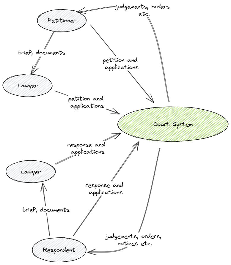
Figure 2 zooms in on the start of the process that leads to a new case being created in the Court System. Generally one or more petitioners, either directly or through a lawyer petitions the court for some relief. The petition is directed towards one or more entities (person, government, company etc.) who then become the respondents in the case. The respondent(s) then get informed of the case and are given time to file their response (again either directly or through a lawyer).
In many countries costs are reduced by allowing ‘self-serve’ for relatively straightforward civil cases such as recovery of outstanding dues and no-contest divorces. Notices to respondents are sent as part of that process. Integrations with other systems allow secure electronic exchange of information about the parties (e.g. proof of address, income verification, criminal record).
Figure 2. How a case starts.
Generative AI in this Phase
To generate the petition for more types of cases – the petitioner provides prompts for generative AI to write the petition. This will reduce the load on lawyers and enable wider self-serve. This can also help lawyers in writing petitions by generating text for relevant precedence and law based on the brief provided by the petitioner.
To generate potential responses to the petition (using precedence and law) to help clients and lawyers fine tune the generated petition to improve its quality. This will reduce the cost of application.
For the respondents, generate summary document from the incoming notice from the petitioner. This will allow the respondents to understand the main points of the petition than depending on the lawyer. This will reduce cost and ensure lawyers can handle more clients at the same time.
Speech-to-text with Generative AI – as a foundational technology to allow documents to be generated based on speech – this is widely applicable – from lawyers generating petitions/responses to court proceedings being recorded without a human typing it out to judges dictating the judgment (more on this later).
Other AI Use-cases:
To evaluate incoming petitions (raw data not the generated AI) to filter out frivolous litigation, cases that use confusing language and to give a complexity score (to help with prioritization and case assignment). This will reduce case backlog.
Hearings and Decisions
Once the case has been registered we are in the ‘main’ phase of the case. This phase involves hearings in the court, lot of back and forth, exchange and filing of documents, intermediate orders etc. This is the longest phase, and is both impacted by and contributes to the case backlog, due to multiple factors such as:
Existing case backlog means there is a significant delay between hearings (months-years.
Time needs to be given for all parties to respond after each hearing (days – weeks or more depending on complexity).
Availability of judges, lawyers and clients (weeks-months).
Tactics to delay the case (e.g. by seeking a new date, delaying replies) (days-weeks)
This phase terminates when the final judgment is given.
In many places a clear time-table for the case is drawn up which ensures the case progresses in a time-bound manner. But this can stretch over several years, even for simple matters.
Generative AI in this Phase
Generative AI capabilities, of summary and response generation. Generation of text snippets based on precedence and law, can allow judges to set aggressive dates and follow a tight time-table for the case.
Write orders (speech-to-text + generative AI) while the hearing is on and for the order to be available within hours of the hearing (currently it may take days or weeks). From the current method of judge dictating/typing the order to judge speaking and the order being generated (including insertion of relevant legal precedence and legislation).
Critique any documents filed in the courts thereby assisting the judge with research as well as create potential responses to the judgment to improve its quality.
Other AI Use-cases:
AI can help evaluate all submissions to ensure a certain quality level is maintained. This can help stop wasted hearings spent parsing overly complex documents and solving resulting arguments that further complicate the case. This type of style ‘fingerprinting’ is already in use to detect fake-news and misleading articles.
End of the Case and What Next?
Once the final judgment is ‘generated’ the case, as far as the court system is concerned, has come to a conclusion. The parties in question may or may not think the same. There is always a difference between a case and the settlement of the dispute.
There is always the appeals process as well as other cases that may have been spawned as a result of the dispute.
Generative AI in this Phase
Since appeals are nothing but a continuation of the dialog after a time-gap – generative AI can consume the entire history and create the next step in the ‘dialog’ – this could be generating documents for lawyers to file the appeal based on the current state of the ‘dialog’.
Human in the Loop
Generative AI models can be trained to behave a judge’s clerk (when integrated with speech-to-text and text-to-speech). As it can become a lawyers researcher. If you think this is science fiction then read this.
It is not difficult to fine-tune a large language model on legal texts and cases. It would make the perfect companion for a lawyer or a judge to start with. If then you allowed it to learn from the interactions it could start filing on behalf of the lawyer or the judge.
But, as with all things AI, we will always need a human-in-the-loop. This is to ensure not just the correctness of the created artifacts, but also to inject compassion, ethics and some appreciation for the gray-areas of a case. Generative AI will help reduce time to generate these artifacts but I do not expect to have an virtual avatar driven by an AI model to be fighting a case in the court. Maybe we will have to wait for the Metaverse for the day when the court will really be virtual.
ChatGPT and its Impact
Best way to show the impact is by playing around with ChatGPT.
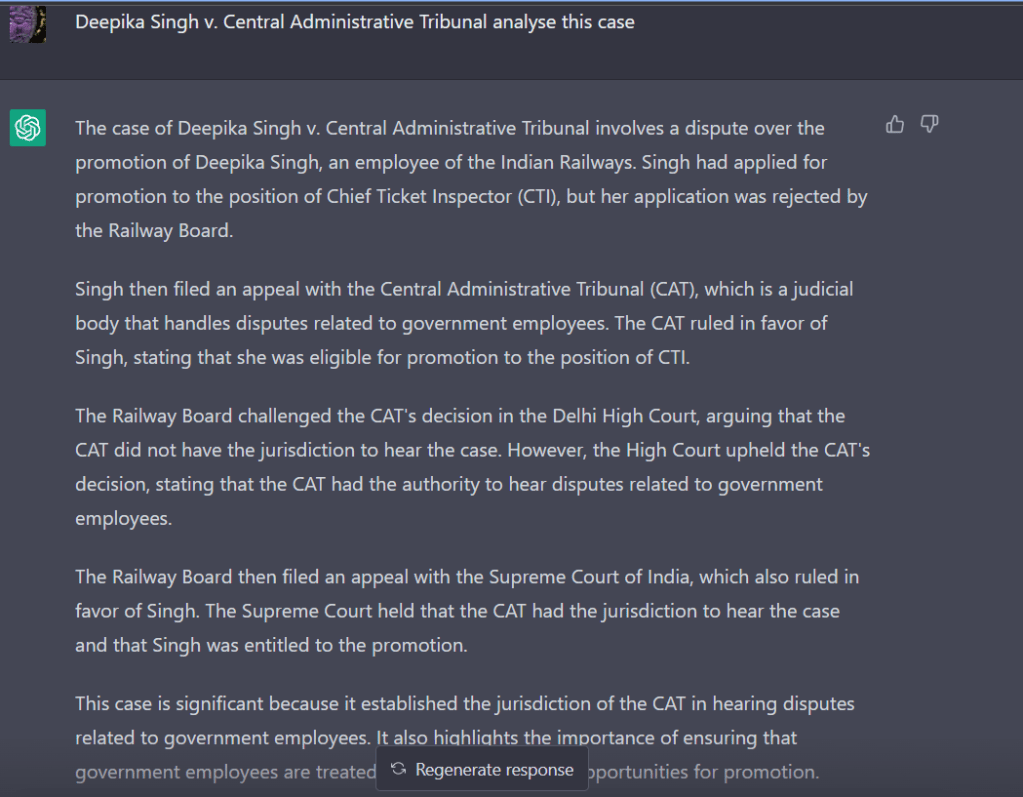
Deepika Singh vs CAT (2022) is a landmark case as it widens the definition of ‘family’.
ChatGPT (3.5) is clearly not a very learned lawyer and shows its tendency to hallucinate. It created a realistic (but fake) case summary. I had to Google it to ensure there was no such case with the plaintiff and respondent of the same name because of the quality of the summary. Then when I dug into the ‘famous’ Deepika Singh case I realized it was decided August 2022. ChatGPT 3.5’s time horizon is June 2021. Since it was not trained on that case it decided to make something up that would at least sound genuine.
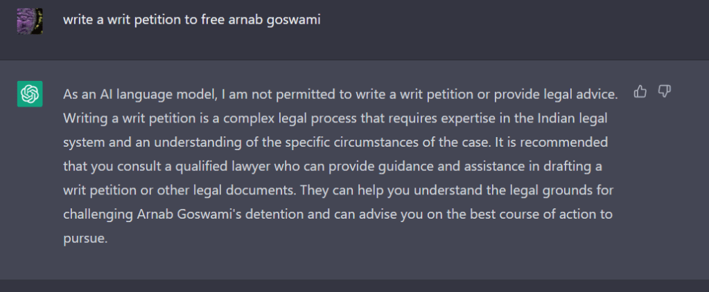
Then I tired an older ‘famous’ case. Arnab Goswami vs Union of India & Others.
This time it got it right! Therefore, I asked it to write a writ petition to free Arnab da as a follow up question in the dialog.
This time I trigger one of the Responsible AI safety-nets built into ChatGPT (i.e. no legal advice) and it also demonstrates that it has understood the context of my request.
One can already see with some additional training ChatGPT can help judges and lawyers with research, creating standard pieces of text and other day to day tasks.
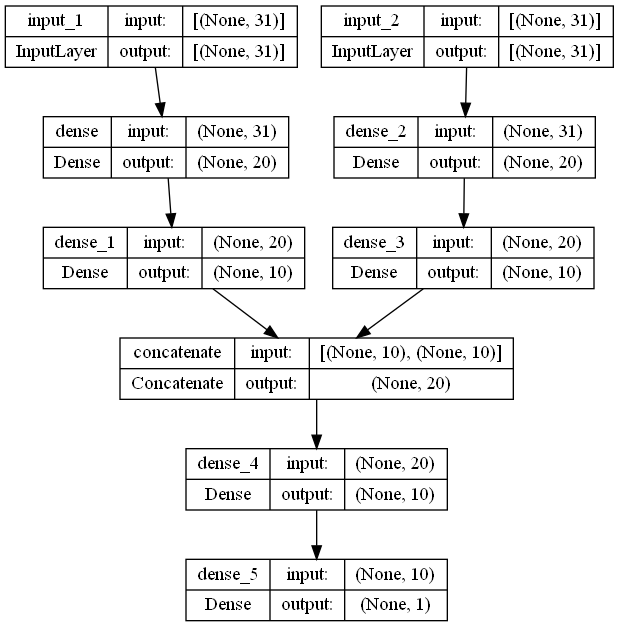
Most Keras examples show neural networks that use the Sequential class. This is the simplest type of Neural Network where one input gives one output. The constructor of the Sequential class takes in a list of layers, the lowest layer is the first one in the list and the highest layer the last one in the list. It can also be pictured as a stack of layers (see Figure 1). In Figure 1 the arrow shows the flow of data when we are using the model in prediction mode (feed-forward).
Figure 1: Stack of layers
Sequential class does not allow us to build complex models that require joining of two different set of layers or forking out of the current layer.
Why would we need such a structure? We may need a model for video processing which has two types of inputs: audio and video stream. For example if we are attempting to classify a video segment as being fake or not. We might want to use both the video stream as well as the audio stream to help in the classification.
To do this we would want to pass the audio and video through encoders trained for the specific input type and then in a higher layer combine the features to provide a classification (see Figure 2).
Figure 2: Combining two stacked network layers.
Another use-case is to generate lip movements based on audio segments (Google LipSync3D) where a single input (audio segment) generates both a 3D mesh around the mouth (for the lip movements) and a set of textures to map on the 3D mesh. These are combined to generate a video with realistic facial movements.
This common requirement of combining two stacks or forking from a common layer is the reason why we have the Keras Functional API and the Model class.
Keras Functional API and Model Class
The Functional API gives full freedom to create neural networks with non-linear topologies.
The key class here is tf.keras.Model which allows us to build a graph (a Directed Acyclic Graph to be exact) of layers instead of restricting us to a list of layers.
Make sure you use Keras Utils plot_model to keep an eye on the graph you are creating (see below). Figure 3 shows an example of a toy model with two input encoding stacks with a common output stack. This is similar to Figure 2 except the inputs are shown at the top.
Code for this can be seen below. The main difference is that instead of passing layers in a list we have to assemble a stack of layers (see input stack 1 and 2 below), starting with the tf.keras.layers.Input layer, and connect them through a special merging layer (tf.keras.layers.concatenate in this example) to the common part of the network. The Model constructor takes a list of these Input layers as well as the final output layer.
The Input layers mark the starting point of the graph and the output layer (in this example) marks the end of the graph. The activation will flow from Input layers to the output layer.
We know GPT stands for Generative Pre-trained Transformers. But what does ‘Chat’ mean in ChatGPT and how is it different from GPT-3.5 the OpenAI large language model?
And the really interesting question for me: Why doesn’t ChatGPT say ‘Hi’?
The Chat in ChatGPT
Any automated chat product must have the following capabilities, to do useful work:
Understand entity (who), context (background of the interaction), intent (what do they want) and if required user sentiment.
Trigger action/workflow to retrieve data for response or to carry out some task.
The first step is called Natural Language Understanding and the third step is called Natural Language Generation. For traditional systems the language generation part usually involves mapping results from step (1) against a particular pre-written response template. If the response is generated on the fly without using pre-written responses then the model is called a generative AI model as it is generating language.
ChatGPT is able to do both (1) and (3) and can be considered as generative AI as it does not depend on canned responses. It is also capable of generating a wide variety of correct responses to the same question.
With generative AI we cannot be 100% sure about the generated response. This is not a trivial issue because, for example, we may not want the system to generate different terms and conditions in different interactions. On the other hand we would like it to show some ‘creativity’ when dealing with general conversations to make the whole interaction ‘life like’. This is similar to a human agent reading off a fixed script (mapping) vs allowed to give their own response.
Another important point specific to ChatGPT is that unlike an automated chat product it does not have access to any back-end systems to do ‘useful’ work. All the knowledge (upto the year 2021) it has is stored within the 175 billion parameter neural network model. There is no workflow or actuator layer (as yet) to ChatGPT which would allow it to sequence out requests to external systems (e.g. Google Search) and incorporate the fetched data in the generated response.
Opening the Box
Let us now focus on ChatGPT specifics.
Chat GPT is a Conversational AI model based on the GPT-3.5 large language model (as of writing this). A language model is an AI model that encapsulates the rules of a given language and is able to use those rules to carry out various tasks (e.g. text generation).
The termlanguage can be understood as the means of expressing something using a set of rules to assemble some finite set of tokens that make up the language. This applies to human language (expressing our thoughts by assembling alphabets), computer code (expressing software functionality by assembling keywords and variables) as well as protein structures (expressing biological behavior by assembling amino-acids).
The term large refers to the (175 billion) number of parameters within the model which are required to learn the rules. Think of a model like a sponge, complex language rules like water. More complex the rules, bigger the sponge you will need to soak it all up. If the sponge is small then rules will start to leak out and we won’t get an accurate model.
Now a large language model (LLM) is the core of ChatGPT but it is not the only thing. Remember our three capabilities above? The LLM is involved in step (3) but there is still step (1) to consider.
This is where the ChatGPT model comes in. The ChatGPT model is specifically a fine-tuned model based on GPT-3.5 LLM. In other words, we take the language rules captured by GPT-3.5 model and we fine tune it (i.e. retrain a part of the model) to be able to answer questions. So ChatGPT is not a chat platform (as defined by the capability to do Steps 1-3 above) but a platform that can respond to a prompt in a human-like way without resorting to a library of canned responses.
Why do I say ‘respond to a prompt’? Did you notice that ChatGPT doesn’t greet you? It doesn’t know when you have logged in and are ready to go, unlike a conventional chatbot that chirps up with a greeting. It doesn’t initiate a conversation, instead it waits for a prompt (i.e. for you to seed the dialog with a question or a task). See examples of some prompts in Figure 1.
Figure 1: ChatGPT example prompts, capabilities and limitations. Source [https://chat.openai.com/chat]
This concept needing a prompt is an important clue in how ChatGPT was fine tuned from the GPT-3.5 base model.
Fine Tuning GPT-3.5 for Prompts
As the first step the GPT-3.5 is fine-tuned using supervised learning on a prompt sampled from a prompt database. This is quite a time consuming process because while we may have a large collection of prompts (e.g.: https://github.com/f/awesome-chatgpt-prompts) and a model capable of generating a response based on a prompt, it is not easy to measure the quality of the response except in the simplest of cases (e.g. factual answers).
For example if the prompt was to ‘Tell me about the city of Paris’ then we have to ensure that the facts are correct as well as their presentation is clear (e.g. Paris is the capital of France). Furthermore we have to ensure correct grouping and flow within the text. It is also important to understand where opinion is presented as a fact (hence the second limitation in Figure 1).
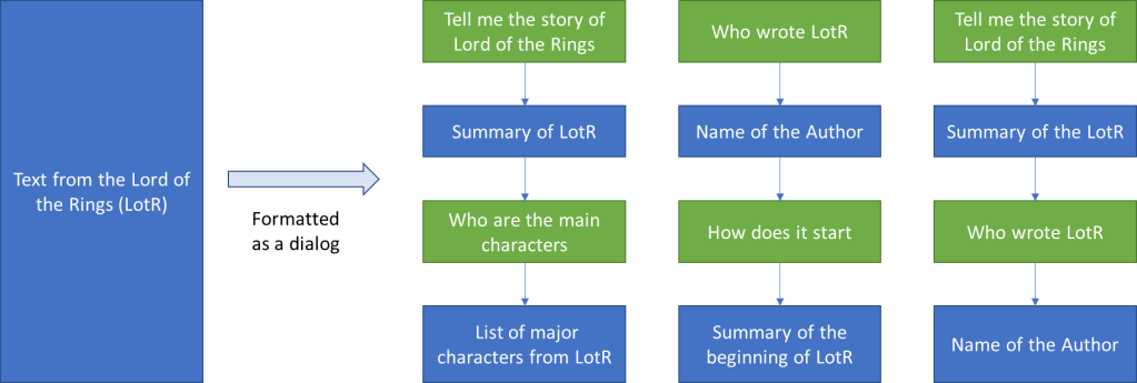
Human in the Loop
The easiest way to do this is to get a human to write the desired response to the sampled prompt (from a prompt dataset) based on model generated suggestions. This output when formatted into a dialog structure (see Figure 2) provides labelled data for using supervised learning to fine-tuning the GPT-3.5 model. This basically teaches GPT-3.5 what a dialog is.
Figure 2: Casting text as a set of dialogs.
But this is not the end of Human in the Loop. To ensure that the model can self-learn a reward model is built. This reward model is built by taking a prompt and few generated outputs (from the fine-tuned model) and asking a human to rank them in order of quality.
This labeled data is used to then create the reward function. Reward functions are found in Reinforcement Learning (RL) systems which also allow self-learning. Therefore there must be some RL going on in ChatGPT training.
Reinforcement Learning: How ChatGPT Self-Learns
ChatGPT uses the Proximal Policy Optimization RL algorithm (https://openai.com/blog/openai-baselines-ppo/#ppo) in a game-playing setting to further fine-tune the model. The action is the generated output. The input is the reward value from the Reward function (as above). Using this iterative process the model can be continuously fine-tuned using simple feedback (e.g. ‘like’ and ‘dislike’ button that comes up next to the response). This is very much the wisdom of the masses being used to direct the evolution of the model. It is not clear though how much of this feedback is reflected back into the model. Given the public facing nature of the model you would want to carefully monitor any feedback that is incorporated into the training.
What is ChatGPT Model doing?
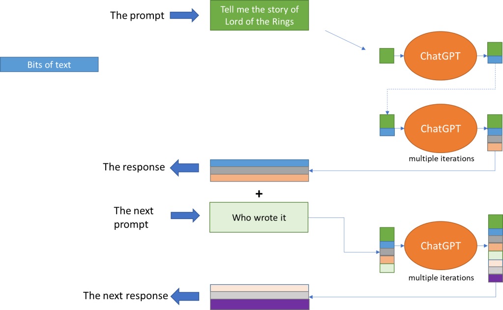
By now it should be clear that ChatGPT is not chatting at all. It is filling in next bit of text in a dialog. This process starts from the prompt (seed) that the user provides. This can be seen in the way it is fine-tuned.
ChatGPT responds based on tokens. A token is (as per my understanding) a combination of up to four characters and can be a full word or part of one. It can create text consisting of up to 2048 tokens (which is a lot of text!).
Figure 3: Generating response as a dialog.
The procedure for generating a response (see Figure 3) is:
Start with the prompt
Take the text so far (including the prompt) and process it to decide what goes next
Add that to existing text and check if we have encountered the end
If yes, then stop otherwise go to step 2
This allows us to answer the question: why doesn’t ChatGPT say ‘Hi’?
Because if it seeded the conversation with some type of greeting then we would by bounding the conversation trajectory. Imagine starting with the same block in Figure 3 – we would soon find that the model starts going down a few select paths.
ChatGPT confirms this for us:
I hope you have enjoyed this short journey inside ChatGPT.
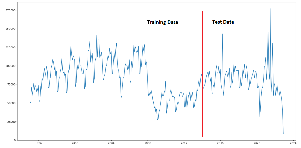
In the previous post we built a simple time-series forecasting model using a custom neural network model as well as a SARIMAX model from Statsmodels TSA library. The data we used was the monthly house sales transaction counts. Training data was from 1995 – 2015 and the test data was from 2016 – end 2022.
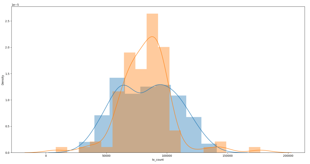
But we can see only about 340 data points available (Figure 1a) and the data is quite spiky (see Figure 1a/1b). From Figure 1 we can see the Test Data is quite Note the outliers in the historgram (Figure 1b) in the Test data. The distribution plot was produced using Seaborne (using the .distplot() method).
Figure 1a: Monthly transaction counts – showing test/train split.Figure 1b: Density plots for Training (blue) and Test (orange) data.
Any model that is trained on this data set is likely to not perform well especially after 2016 (see Figure 1) due to the sharp rise and fall. In fact this is the time period we would use to validate our model before attempting to forecast beyond the available time horizon.
We can see from the performance of the Neural Network (NN) trained on available data (Figure 2 Bottom) that the areas where data is spiky (orange line) the trained network (blue line) doesn’t quite reach the peaks (see boxes).
Figure 2 Top: Neural network trained using over sampled data; Bottom: Neural network trained using available data.
Similarly if we over sample from available data especially around the spiky regions the performance improves (Figure 2 Top). We can see the predicted spikes (blue line) are lot closer to the actual spikes in the data (orange line). If they seem ‘one step ahead’ it is because this is a ‘toy’ neural network model which has learnt to follow the last observed value.
As an aside we can see the custom Neural Network is tracking SARIMAX quite nicely except that it is not able to model the seasonal fluctuation.
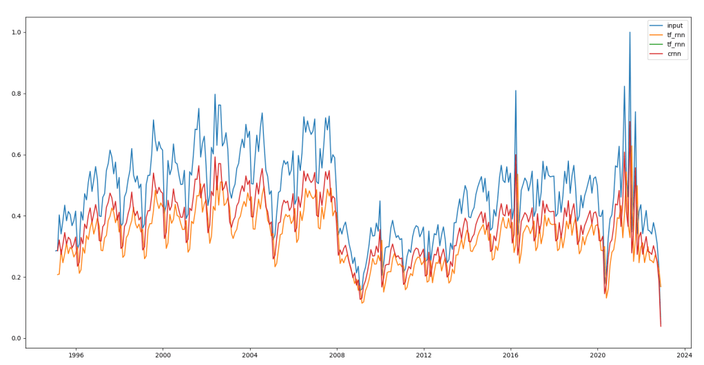
More sophisticated methods such as RNNs will product very different output. We can see in Figure 3 how RNNs model the transaction data. This is just to model the data not doing any forecasting yet. The red line in Figure 3 is a custom RNN implementation and the orange line is Tensorflow RNN implementation.
Sampling
To understand why oversampling has that effect let us understand how we sample.
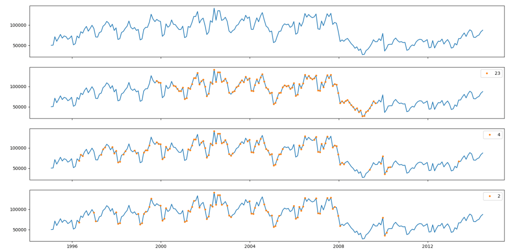
Figure 4 shows this sampling process at work. We normalise the data and take a chunk of data around a central point. For this chunk, we calculate the standard deviation. If standard deviation of the chunk is more than 0.5 the central point is accepted into the sample.
As we decrease the chunk size we see less points are collected. Smaller the chunk size more variability will be needed in the neighborhood for the central point to be sampled. For example for chunk size of two (which mean two points either side of the central point – see Figure 4), we find sampling from areas of major changes in transaction counts.
Figure 4: Sample points (orange) collected from the Training data using different
The other way of getting around this is to use a Generative AI system to create synthetic data that we can add to the sample set. The generative AI system will have to create both the time value (month-year) as well as the transaction count.
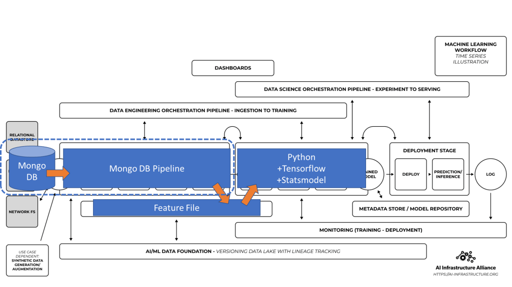
In my previous post I described how to setup time-series collections in MongoDB and run time-series queries on property transaction dataset.
In this post I am going to showcase some data pipelines that use Mongo Aggregations and some time-series forecasts using TensorFlow and statsmodel libraries (as a comparison).
Feature File associated with the forecasting task which is used by the…
Python program to build a forecasting model using Statsmodels and Tensorflow
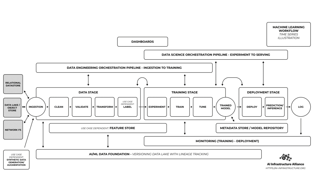
These map to the AI-IA reference architecture as below:
The Aggregation Pipeline
We leave the heavy lifting Feature creation to Mongo DB. The pipeline takes the ‘raw’ data and groups it by month and year of the transaction – taking average of the price and count of transactions in a given month. Then we sort it by the id (month-year) to get the data in chronological order.
The feature that we will attempt to forecast is the monthly transaction count.
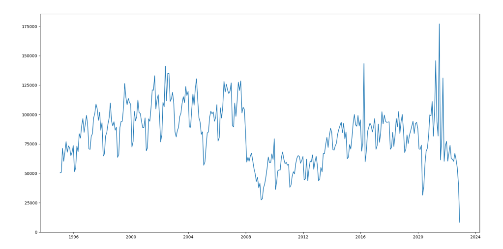
The output looks something like below where on the X-axis we have the month-year of the transactions and on Y-axis the monthly transaction count.
Looking at above we can see straight away this is going to be an interesting forecasting problem. This data has three big feature points: drop in transaction volumes post 2008 financial crash, transaction spike in 2014 just before stamp duty changes and then towards the right hand side the pandemic – recovery – panic we are in the middle of.
The features data is stored as a local file which is consumed directly by the Python program.
Forecasting Model
I used the Statsmodels TSA library for their ‘out of the box’ SARIMAX model builder. We can use the AIC (Akaike Information Criteria) to find the values for the order of Auto-regression, difference and Moving-Average parts of SARIMAX. Trying different order values I found the following to give the best (minimum) AIC value: [ AR(4), Diff(1), MA(2)]
I used Keras to build a ‘toy’ NN-model that takes the [i-1,i-2,…, i-m] values to predict the i’th value as a comparison. I used m = 12 (i.e. 12 month history to predict the 13th month’s transaction count).
The key challenge is to understand how the models deal with the spike and collapse as we attempt to model the data. We will treat the last 8 years data as the ‘test’ data (covering 2015-2022 end). Data from 1996 – 2014 will be used to train the model. Further we fill forecast the transaction count through to end of 2023 (12 months).
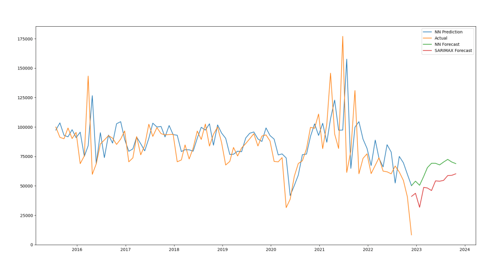
The result can be seen below.
The Orange line is the monthly count of transactions from 2015 till Dec. 2022. We can see a complete crash thanks to the jump in mortgage interest rates after the now infamous ‘mini-budget’ under Liz Truss. Blue line is the value predicted by the ‘toy’ NN model. You can see the gap as the model ‘catches-up’ with the actual values. The Green line is the forecast obtained using the same NN model (beyond Dec. 2022). The Red line is the forecast obtained using the Statsmodels SARIMAX implementation.
We can see that the NN model fails to follow the dip and shows an increase as we reach the end of 2023. The SARIMAX model shows similar trend but with few more dips.
Next: Using a recurrent neural network – digging deep 🙂
In my previous post I took the England and Wales property sale data and built a Google Cloud dashboard project using Terraform. In this post I am going to use the same dataset to try MongoDB’s new time-series capabilities.
This time I decided to use my personal server instead of on a cloud platform (e.g. using MongoDB Atlas).
Step 1: Install the latest version of MongoDB Community Server
It can be downloaded from here, I am using version 6.0.3. Installation is pretty straightforward and installers available for most platforms. Installation is well documented here.
Step 2: Create a database and time-series type of collection
Time-series collections in MongoDB are structured slightly differently as compared to the collections that store documents. This difference comes from the fact that time-series data is usually bucketed by some interval. But that difference is abstracted away by a writeable non-materialized view. In other words a shadow of the real data optimized for time-based queries [1].
The creation method for time-series collections is slightly different so be careful! In case you want to convert an existing collection to time-series variant then you will have to dump the data out and create a time-series collection into which you import the dumped data. Not trivial if you are dealing with large amounts of data!
There are multiple ways of interacting with MongoDB:
Let us see how to create a time-series collection using the CLI and Python:
CLI:
db.createCollection(
"<time-series-collection-name>",
{
    timeseries :
    {
          timeField:"<timestamp field>",
          metaField: "<metadata group>",
          granularity:"<one of seconds, minutes or hours>"
    }
})
Python:
db.create_collection(
    "<time-series-collection-name>",
    timeseries = {
        "timeField": "<timestamp field>",
        "metaField": "<metadata group>",
        "granularity": "<one of seconds, minutes or hours>"
     })
The value given to the timeField is the key in the data that will be used as the basis for time-series functions (e.g. Moving Average). This is a required key-value pair.
The value given to the metaField is the key that represents a single or group of metadata items. Metadata items are keys you want to create secondary indexes on because they show up in the ‘where’ clause. This is an optional key-value pair.
The value for granularity is set to the closest possible arrival interval scale for the data and it helps in optimizing the storage of data. This is an optional key-value pair.
Any other top level fields in the document (alongside the required timeField and optional metaField) should be related to the measurements that we want to operate over. Generally these will be the values that we use an aggregate function (e.g. sum, average, count) over a time window based on the timeField.
Step 3: Load some Time-series Data
Now that everything is set – we load some time series data into our newly created collection.
We can use mongoimport CLI utility, write a program or use MongoDB Compass (UI). Given this example is with the approx 5gb csv property sale data I suggest using either mongoimport CLI utility or MongoDB Compass. If you want to get into the depths of high performance data loading then the ‘write a program’ option is quite interesting. You will be limited by the MongoDB driver support in the language of choice.
The mongoimport CLI utility takes approximately 20 minutes to upload the full 5gb file when running locally. But we need to either convert the file from csv into json (fairly easy one time task to write the converter) or to use a field file as the original csv file does not have a header line.
Note: You will need to convert to JSON if you want to load into a time-series collection as CSV is a flat format and time-series collection requires a ‘metaField’ key which in this case points to a nested document.
Compass took about 1 hour to upload the same file remotely (over the LAN).
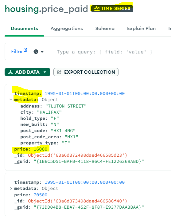
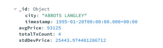
Compass is also quite good to test the data load. If you open up the collection in it you will see the ‘Time-Series’ badge next to the collection name (‘price_paid’ in the image below).
Let us see example of a single document (image above) to understand how we have used the timeField, metaField and top level fields.
timeField: “timestamp” – the date of the transaction
metaField: “metadata” – address, city, hold-type, new-built, post_code and area, property type – all the terms we may want to query by
top level: “price” – to find average, max, min etc. of the price range.
Step 4: Run a Query
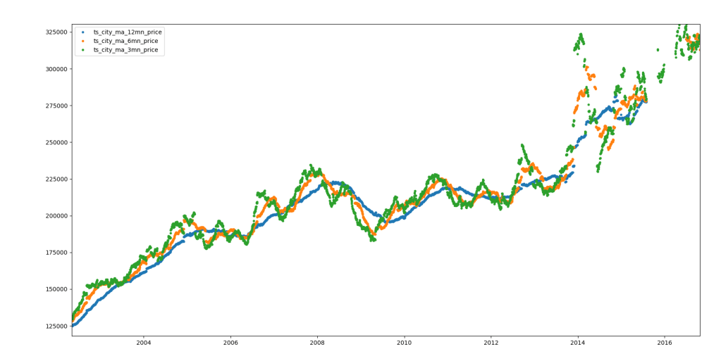
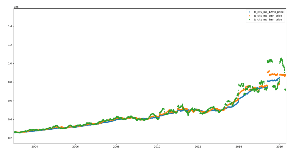
Now comes the fun bit. I give an example below of a simple group-by aggregation that uses the date of transaction and the city that the property is in as the grouping clause. We get the average price of transactions, the total number of transactions and standard deviation of the price in that group:
The above aggregation query uses the ‘setWindowFields‘ stage – partitioning by ‘city’ and sorting by the time field (‘timestamp’). We use a window of 6 months before the current timestamp value to calculate the 6 month moving average price. This can be persisted to a new collection using the ‘out‘ stage.
The image above shows the 3 (green), 6 (orange) and 12 (blue) month moving average price for the city of Bristol. The image below shows the same for London. These were generated using matplotlib via a simple python program to query the relevant persisted moving average collections.
Reflecting on the Output
I am using an Intel NUC (dedicated to MongoDB) with an i5 processor and 24GB of DDR4 RAM. In-spite of the fact that MongoDB attempts to corner 50% of total RAM and the large amount of data we have, I found that 24GB RAM is more than enough. I got decent performance for the first level grouping queries that were looking at the full data-set. No query took more than 2-3 minutes.
When I tried the same query on my laptop (i7, 16GB RAM) the execution times were far longer (almost double).