Recurrent Neural Networks (RNN):
RNNs are used when temporal relationships have to be learnt. Some common examples include time series data (e.g. stock prices), sequence of words (e.g. predictive text) and so on.
The basic concept of RNNs is that we train an additional set of weights (along with the standard input – output pair) that associate past state (time: t-1) with the current state (time: t). This can then be used to predict the future state (time: t+1) given the current state (time: t). In other words RNNs are NNs with state!
When used to standard time series prediction the input and output values are taken from the same time series (usually a scalar value). This is a degenerate case of single valued inputs and outputs. Thus we need to learn the relationship between x(t-1) and x(t) so that we can predict the value of x(t+1) given x(t). This is what I did for this post.
Time series can be made more complicated by making the input a vector x of different parameters, the output may still remain a scalar value which is a component of x or be a vector. One reason this is done is to add all the factors that may impact the value to be predicted (e.g. x(t+1)). In our example of average house prices – we may want to add factors such as time of the year, interest rates, salary levels, inflation etc. to provide some more “independent” variables in the input.
Two final points:
- Use-cases for RNNs: Speech to Text, Predictive Text, Music Tagging, Machine Translation
- RNNs include the additional complexity of training in Time as well as Space therefore our standard Back-Propagation becomes Back-Propagation Through Time
RNN Structure for Predicting House Prices:
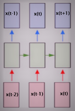
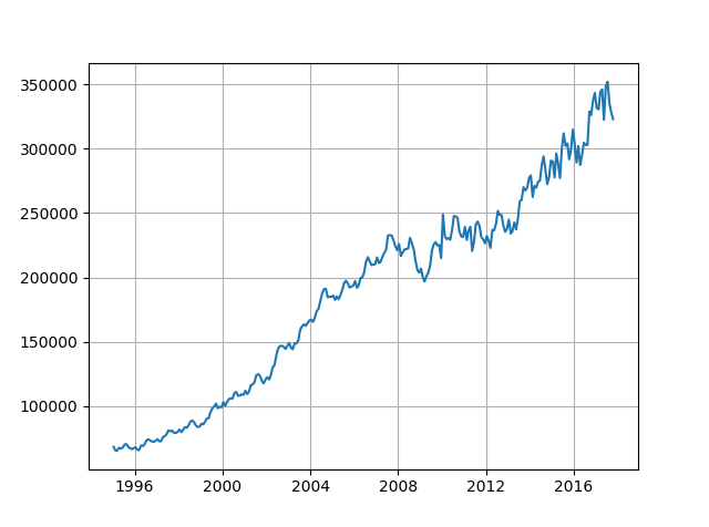
The basic time series problem is that we have a sequence of numbers – the average price of houses for a given month and year (e.g. given: X(1), X(2), … X(t-1), X(t) ) with a regular step size and our task is to predict the next number in the sequence (i.e. predict: X(t+1)). In our problem the avg price is calculated for every month since January 1995 (thus step size is 1 month). As a first step we need to define a fixed sequence size that we are going to use for training the RNN. For the input data we will select a sub-sequence of a given length equal to the number of inputs (in the diagram above there are three inputs). For training output we will select a sub-sequence of the same length as the input but the values will be shifted one step in the future.
Thus if input sub-sequence is: X(3), X(4) and X(5) then the output sub-sequence must be: X(4), X(5) and X(6). In general if input sub-sequence spans time step a to b where b > a and b-a = sub-sequence length, then the output sub-sequence must span a+1 to b+1.
Once the training has been completed if we provide the last sub-sequence as input we will get the next number in the series as the output. We can see how well the RNN is able to replicate the signal by starting with a sub-sequence in the middle and movie ahead in time steps and plotting actual vs predicted values for the next number in the sequence.
Remember to NORMALISE the data!
The parameters are as below:
n_steps = 36 # Number of time steps (thus a = 0 and b = 35, total of 36 months)

n_inputs = 1 # Number of inputs per step (the avg. price for the current month)

n_neurons = 1000 # Number of neurons in the middle layer

n_outputs = 1 # Number of outputs per step (the avg. price for the next month)

learning_rate = 0.0001 # Learning Rate

n_iter = 2000 # Number of iterations

batch_size = 50 # Batch size
I am using TensorFlow’s BasicRNNCell (complete code at the end of the post) but the basic setup is:
X = tf.placeholder(tf.float32, [None, n_steps, n_inputs])
y = tf.placeholder(tf.float32, [None, n_steps, n_outputs])

cell = tf.contrib.rnn.OutputProjectionWrapper(tf.contrib.rnn.BasicRNNCell(num_units = n_neurons, activation = tf.nn.relu), output_size=n_outputs)

outputs, states = tf.nn.dynamic_rnn(cell, X, dtype = tf.float32)

loss = tf.reduce_mean(tf.square(outputs-y))
opt = tf.train.AdamOptimizer(learning_rate=learning_rate)
training = opt.minimize(loss)

saver = tf.train.Saver()

init = tf.global_variables_initializer()
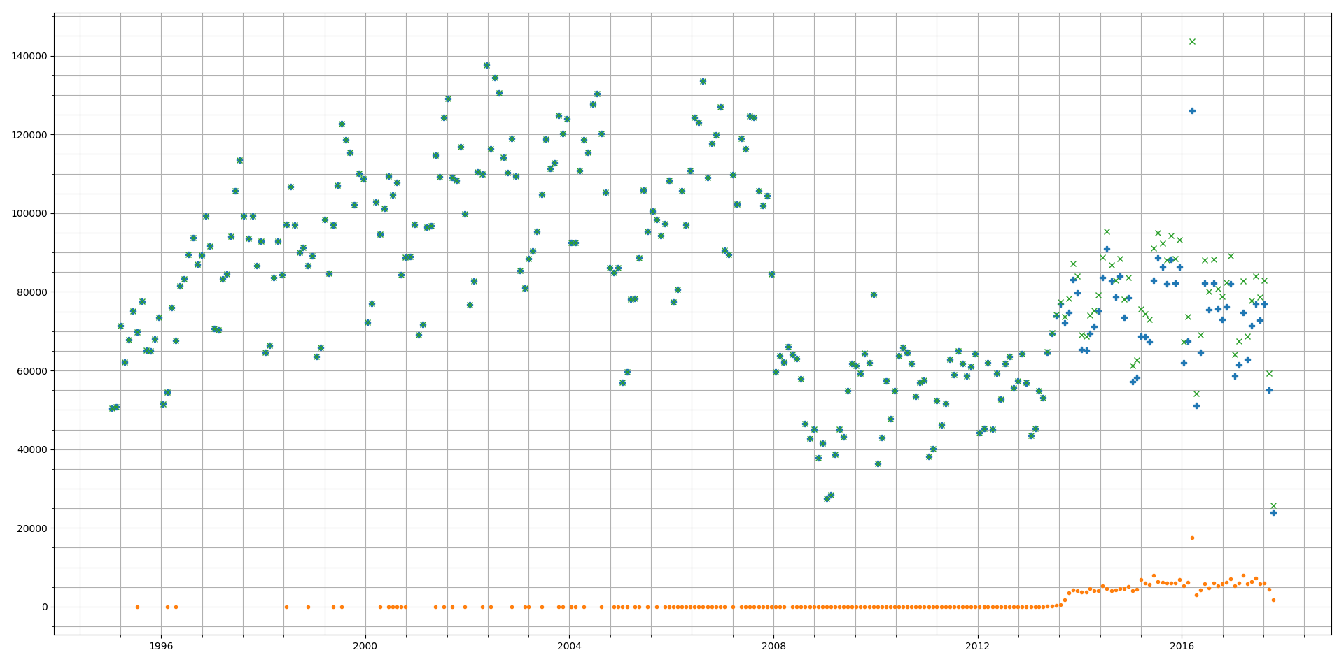
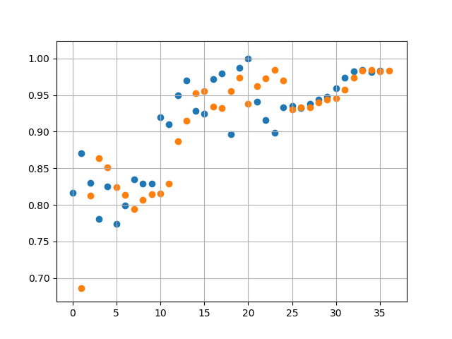
Results:
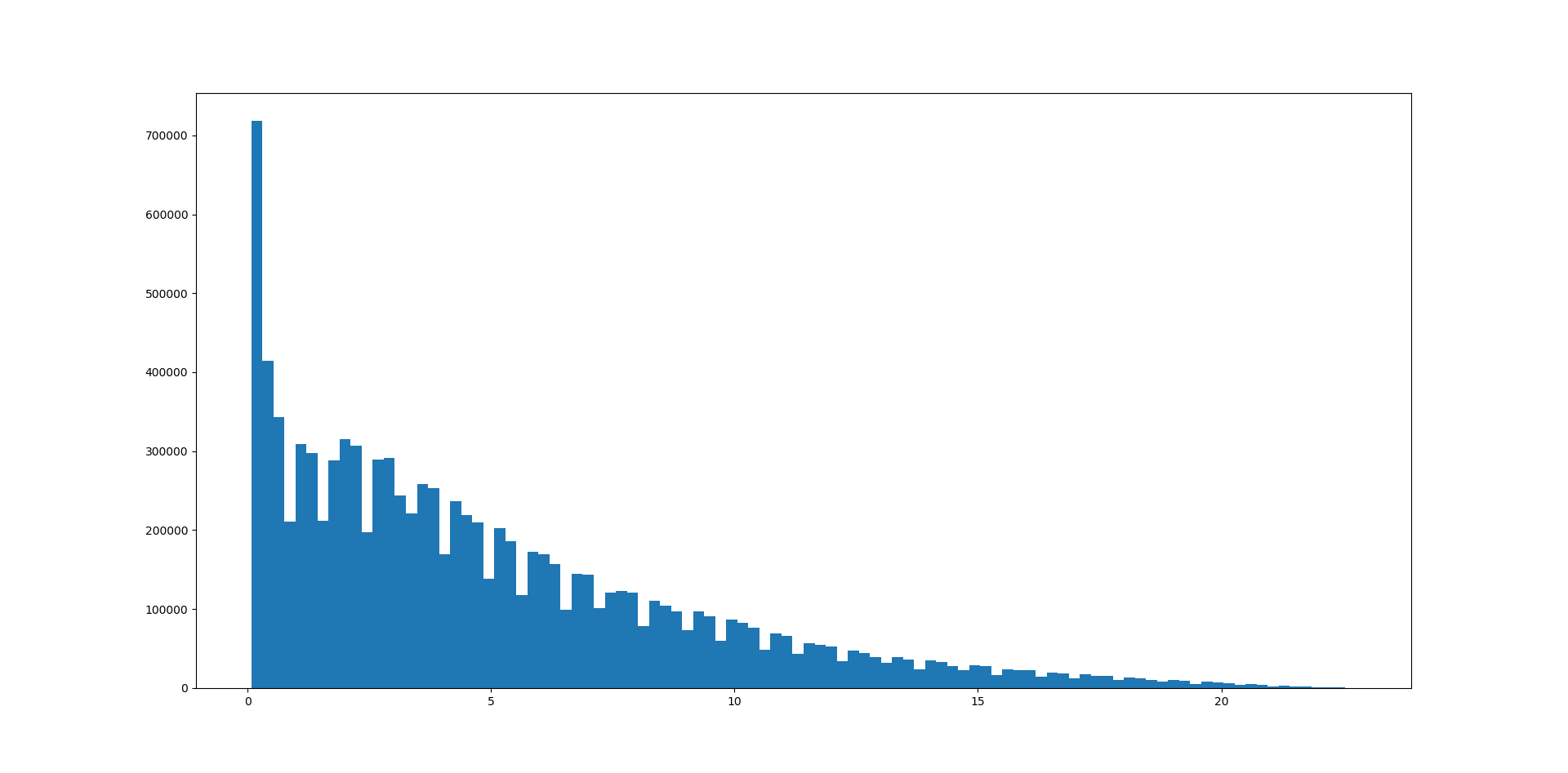
A sample of 3 runs, using Mean Squared Error threshold of 1e-4 we get the following values for Error:
- 8.6831e-05
- 9.05436e-05
- 9.86998e-05
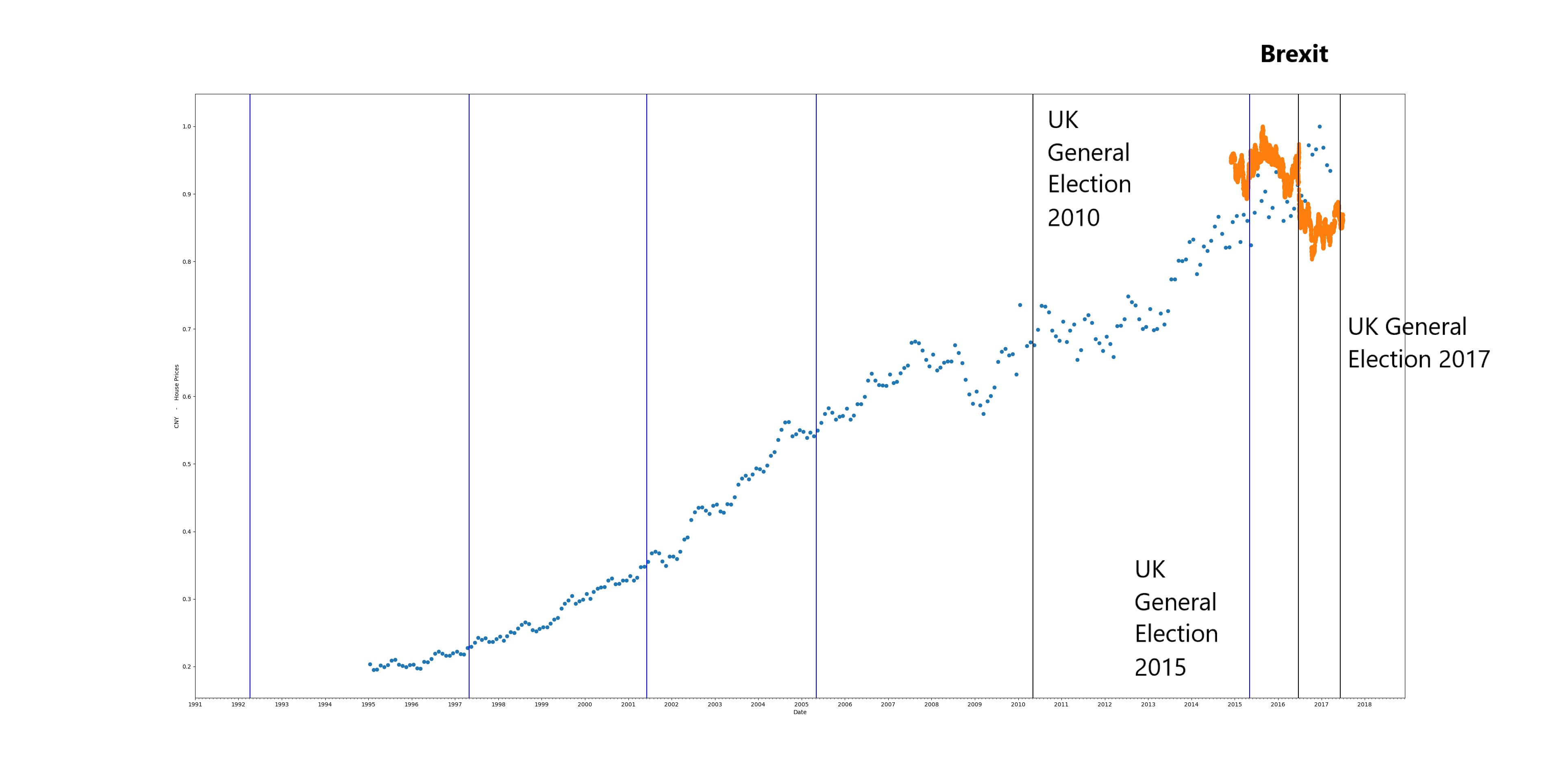
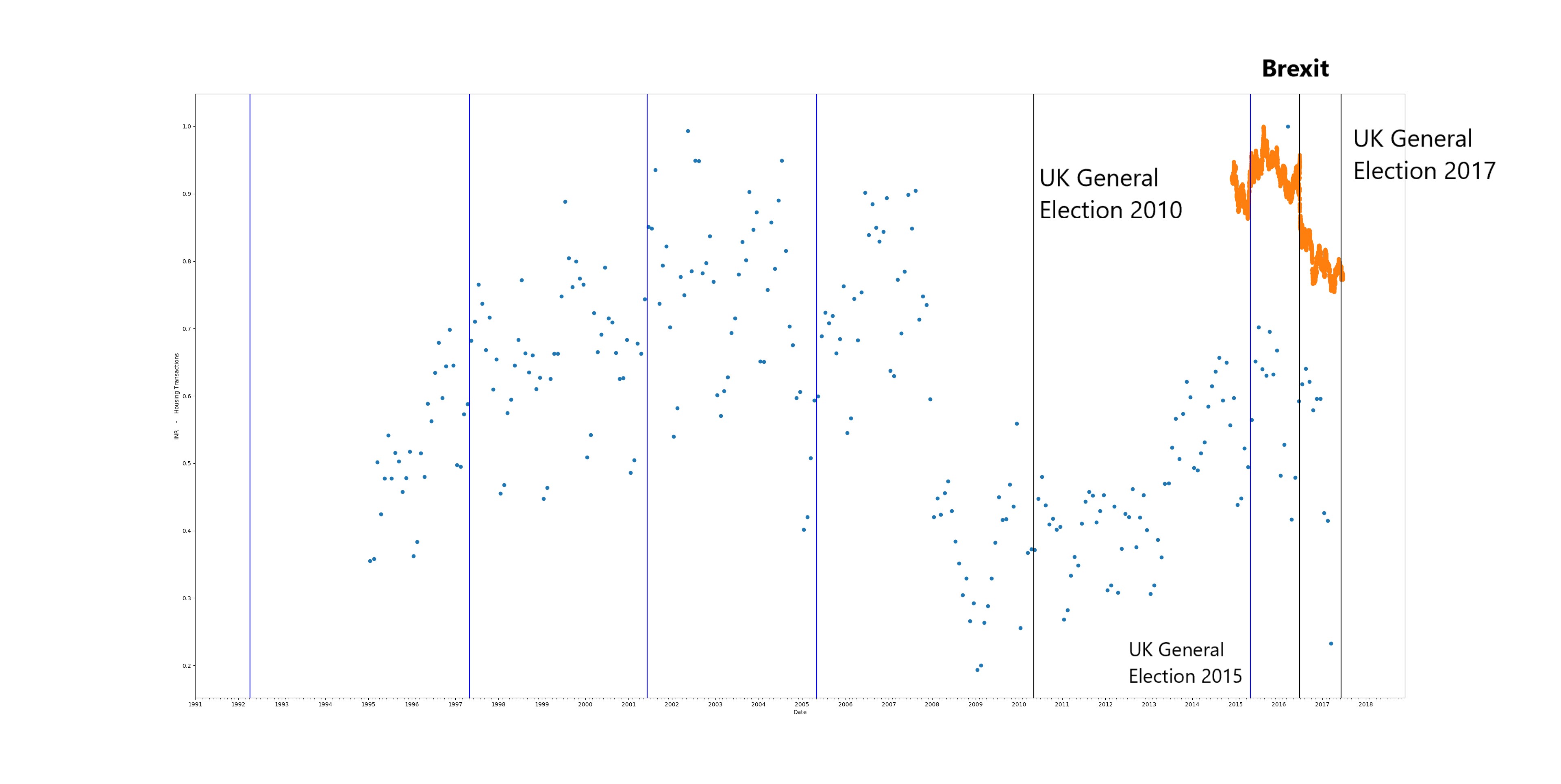
Run 3 fitting and predictions are shown below:
Orange dots represent the prediction by the RNN and Blue dots represent the actual data
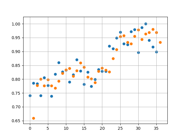
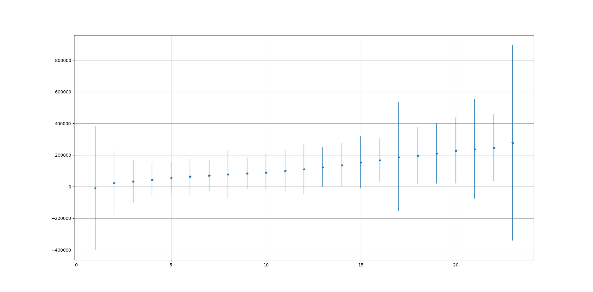
Then we start from October 2017 (Month 24 in figure below) and forecast ahead to October 2018. This predicts a rise in average prices which start to plateau 3rd quarter of 2018. Given that average house prices across a country like UK are determined by a large number of noisy factors, we should take this prediction with a pinch of salt.
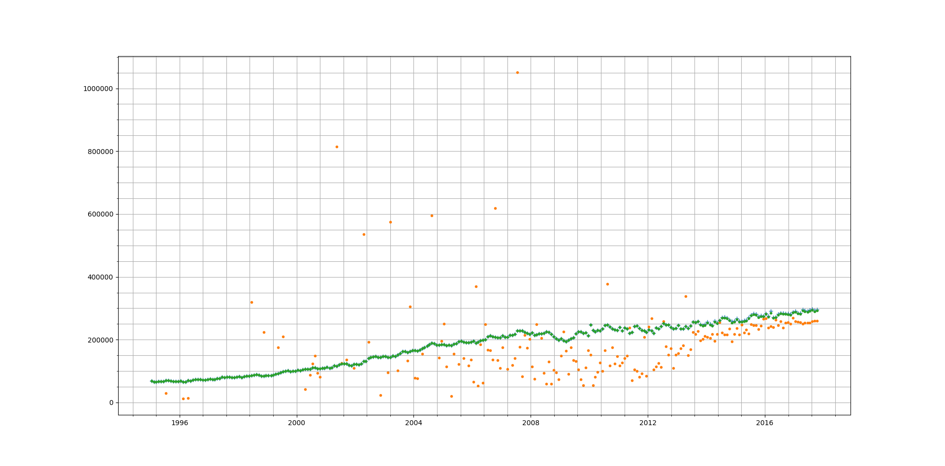
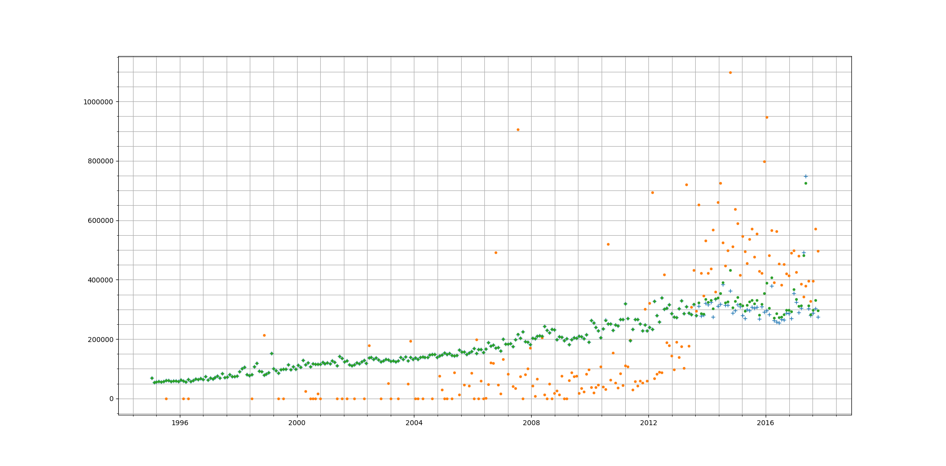
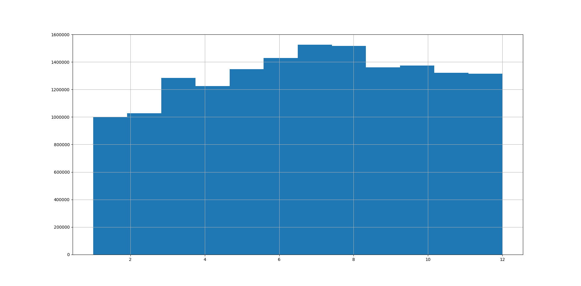
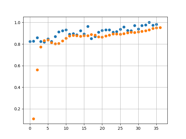
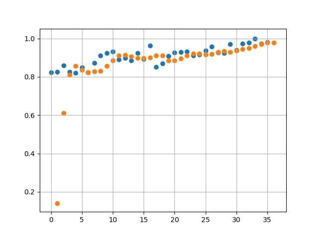
A sample of 3 runs, using Mean Squared Error threshold of 1e-3 we get the following values for Error:
- 3.4365e-04
- 4.1512e-04
- 2.1874e-04
With a higher Error Threshold we find when comparing against actual data (Runs 2 and 3 below) the predicted values have a lot less overlap with the actual values. This is expected as we have traded accuracy for reduction in training time.
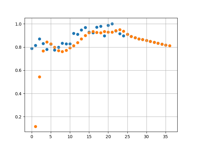
Projections in this case are lot different. We see a linearly decreasing avg price in 2018.
Next Steps:
I would like to add more parameters to the input – but it is difficult to get correlated data for different things such as interest rates, inflation etc.
I would also like to try other types of networks (e.g. LSTM) but I am not sure if that would be the equivalent of using a canon to kill a mosquito.
Finally if anyone has any ideas on this I would be happy to collaborate with them on this!
Source code can be found here: housing_tf
Contains HM Land Registry data © Crown copyright and database right 2017. This data is licensed under the Open Government Licence v3.0.